Crit time. - get used to it.
")
Notable things that stand out to me.
1) over exposed - its far too bright. - things are either fully lit or in full shadow. There should be many gradients in between.
2) Blown out areas such as lamp/ wheels on tv stand - incorrect shader used.
3) No/few soft shadows
4) Too few samples used in gi/radiosity/rendering calculation
5) Bad textures used for poster and carpet (appear blury) - maybe sampling issues.
6) UV mapping appears distorted on wall & carpet.
7) Sky texture. - even though this appears to be a upper floor room. the sky/clouds appear to go to almost ground level suggesting this is some crazy 50 story building. something representing land outside - treetops/roofs/hills would make it more believable.
8)Models - all have right angle edges - look around your room, how many items of furniture actually have right angle edges - Most are beveld/rounded in some manner - as are the corners of walls etc. The Pillows (really?).
As a designer - why would you choose to create something in nasty laminate when cost is no issue ?
7) Stock models used. - I appologise in advance if I am incorrect, however this image stinks of stock models. - basically poor quality 3D clip art. If you try and pass this off as your work you had better be sure it is your work. Or you wont get far in the industry. - There is nothing wrong with stock items, if used appropriately and creatively. However passing a whole scene off as your own work is a dangerous game -Especially if you are aiming for a modeling position rather than rendering.
I'd suggest you may have created the windows/walls.
For this reason I'm out..


")
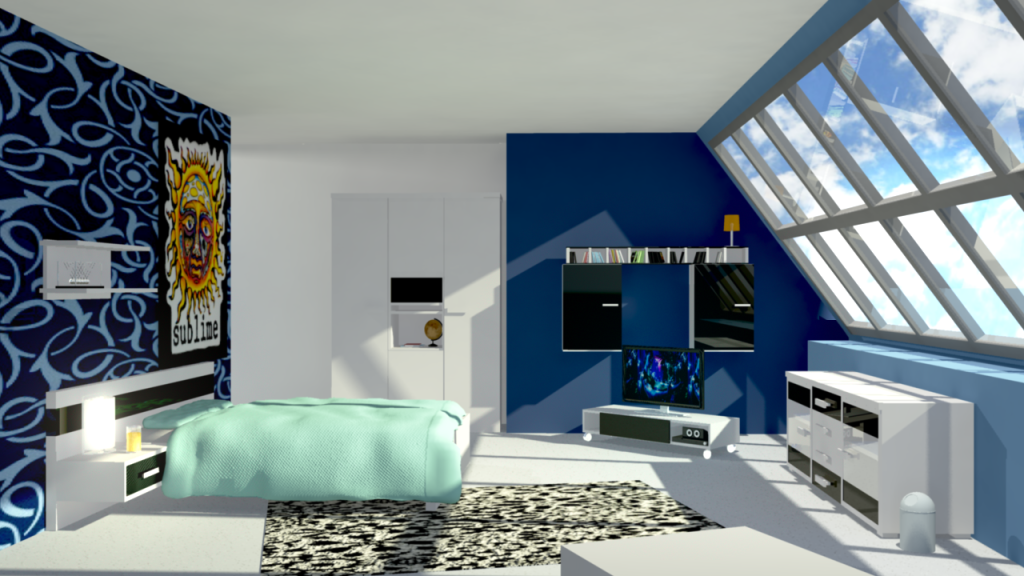
 and the furniture looks exactly the same as the reference photo I modeled. Maybe could use some light beveling though.