Why I haven't been on the forums (for quite some time)

Soldato
Joined
17 Aug 2012
Posts
6,595
Location
Tamworth, UK
Clicking "Home" should return to the main homepage of products, not the splash screen IMO, if anything I'd remove the enter screen entirely, you want products immediately on screen when a user hits the site.

pictures are bad, they could be clearer (they are blurry) and try not to have shadows on the pics especially shadows that run off the edge of the image it doesn't look good and ALL pictures should be taken the same way in the same light for consistency, i noticed some had a grey background and others were white

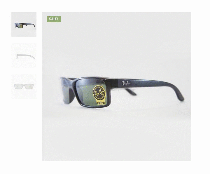
100% this, the thumbnails need to be better and consistent throughout the site. Some white, some grey, some shadows, different angles looks odd.
 
Man of Honour
Joined
19 Oct 2002
Posts
29,524
Location
Surrey
Teacher! Teacher! That kid did a bad thing!


Africanos - I can't really add much to what others have said except that the stock levels are none of a customer's business, you either have something in stock or you don't, I'd remove the "xx in stock" with each product and simply have in stock or out of stock.

Good luck with this, I think with a bit of work and a few tweaks you'll be alright :)

Sometimes a "low stock" indicator can be useful and prompt someone into buying. But I agree the actual numbers probably shouldn't be visible.
 
Associate
Joined
5 Feb 2008
Posts
2,207
Isn't promoting your own business against the rules of this forum? I know a few people got banned etc., on the Photography section for doing the same thing....
 
Soldato
Joined
25 Jul 2010
Posts
4,077
Location
Worcestershire
Genuine piece of feedback.

I'm getting a bit low on contact lenses so thought I'd compare the process with ordering from another site. One big issue is that I can't actually select the lense 'power'. I thought at first I was using the click box thing beneath where it says SPH (Power), but looks like that's actually just for the number of boxes - and it integers only.

So you won't get a single contact lense sale until you sort that
 
Associate
Joined
23 May 2005
Posts
2,156
Just a small point, I would add an "About Us" page. Introduction to your company, its values and vision, maybe the team, why people should buy from you. Talk about your discounts etc, that you are located in Greece etc.

As for the rest of the website. It's not a bad start but needs a lot of refining... One thing I would do is not have a sale or a discount on "new arrivals".. As others have already pointed out, every item is discounted and unless that is part of your marketing strategy I would change it for this section.

It might be worth adding Amazon Pay to give customers confidence, they don't charge monthly, but on each sale a %.
 
Associate
Joined
16 Dec 2010
Posts
1,807
It would be nice to have some homogeneity with the pictures. I'm frequently seeing pictures with either different angles or different shades of background.

Also, if it's my first time looking at a product, when I click on the thumbnails to check other pictures there is a silhouette of the picture and then a 1-2 second delay before the colour picture loads. As shown:

7279750dd224ad678ec7edfcb3dde344.gif
 
Associate
Joined
4 Mar 2010
Posts
914
Location
Coventry
my 2p..

Filter by male/female/kids
View x/All per page
NEWNESS - makes it sound a tad bad Engrish

I am sure others have mentioned enough about general layout / pathways not being clear or hidden after moving from homepage.
 
Associate
Joined
16 Jan 2008
Posts
636
Location
East Sussex
I don't like that the price gets hidden if I hover anywhere near one of the selections.

Put the "Add to cart option" under the price? Price defaulting to Euros is off putting for UK buyers.

I second this. Annoying as hell not seeing the price all the time. Also real time stock will help with sales.
 
Associate
OP
Joined
1 Mar 2014
Posts
2,419
1) Fixed autocurrency switcher
2) Deleted all the currency switcher dropdowns on homepage, category pages and product pages (basically everywhere)
3) Put back everything to normal prices
4) Added a Sale page (discount eyewear) in top menu, added just a few products
5) Changed Shop menu link to - All Products
6) Made footer links different colour so they are easier identified
7) Deleted subscribe button pic and made it a simple link
8) Talked with accountant and set the relevant tax ( which is non taxable) ATM due to volume of sales.
9) Fixed the cart image at the bottom and added fontawesome icons with text

Going to see what I can do with the homepage so its less "spammy" and less "2000"
Going to get the photographer to take all the pics again with male or female models and a specific backround so there's consistency.
 
Last edited:
Back
Top Bottom