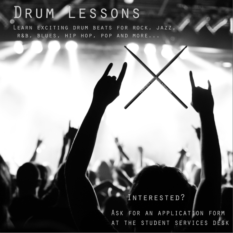
OCuK, lend me your eyes!

That's a lot better but I personally don't like the font.
I'd also centralise the first sentence, in fact the title isn't in the centre.
And where it says the drummers name, get that over to the centre.

Thanks. Yep, all that needs centering. For some reason, I wasn't able to do 'step backwards' and 'undo' on some things in photoshop, so I'll do it all again. But I know the format I'm doing now so it won't take long.

What font do you have in mind? I was looking for the same font as in the title of the first drum ad you posted but I can't find anything similar in photoshop.

Also, do you think it would be better to have 'Interested? Ask for an application form at the..' above the photo, like more in the middle of the ad, and move the photo and young drummer of the year logo down a bit?

Fonts are down to the individual but don't use more than two different ones.
Just bring the 'Interested' word down a bit so it's equal between the Young Drummer Logo and the bottom sentence.
Also what Dirtychinchilla suggests, unstretch the drummer picture to normal and leave the background around it.
Should there be an exclamation mark at the end of songs?

I also have a problem with capitals everywhere.
Try it with DRUM LESSONS & INTERESTED and write the other stuff normal.
 
what about something super simple like this.
c83df071c4d9ab4c77637147466bc01d.png

As others have said though, the ones serious about learning drums will more than likely find you if you're in a school.
 
Cheers guys for the help.

SGF, I agree with all you suggest and will make adjustments. I agree about upper case. That font only does capital letters. I think I'll leave the exclamation mark in. My main target has always been the youngest kids in the school, year 7. Historically they've been my largest uptake of drums and so to me the exclamation mark shouts enthusiasm. Like, 'kids, see how much fun you can have on drums!'

Thanks powelly. Actually looks very cool. However, I'll stick with my current
ad for now. But I've saved yours as a backup. I'll see how things go first with my ad.

EVH, thanks, I'll try Comic Sans.

dirtychinchilla, I do agree. I'll un-stretch it.


I'll upload a new one later.
 
The latest one is not bad at all. I'm guessing this is officially through the school though - dont you have to include their logos, LA, etc font and such? Or is this merely free private lessons provided by you?
 
The latest one is not bad at all. I'm guessing this is officially through the school though - dont you have to include their logos, LA, etc font and such? Or is this merely free private lessons provided by you?

Not free, no. I'll tell you how it works. I'm employed by the school, (though self employed) but most of the money I earn is direct from parents. The school has specialist music teachers called peripatetics for drums, guitar, strings, woodwind, etc. The school has its own official letter and application form which is sent out to new students informing them that there are one to one instrument lessons available at the school during school times. It tells them how much the lessons cost for either 20 minute or 30 minute lessons. So I get cheques from new parents via the school, and when it's time to renew existing students, I directly invoice the parents.

The school pays me from their own budget when there are GCSE or BTEC students who are entitled to free lessons. And if parents are low income and their kid gets free school meals, then music lessons are half price for them, in which case, the school pays me the other half of the fee.

But to your other point, nope, for this posted ad I don't have to use their logo or anything else. It'll just go up in one of the public area noticeboards where students regularly pass by. Without me putting up this ad, I'd still get new students and renewing students, but this ad might attract even more interest and as I like earning more money, it's worth the effort. :D

So guys, I think it's finished. I've un-stretched the picture, I learnt that holding down shift during free transform keeps the ratio. I've fitted in everything I wanted and think I've gotten away with it not being too cluttered. I tried to line everything up as good as possible, I think it's all pretty much centred?

https://s9.postimg.org/5lrvxt973/St_Ignatius_drum_ad.jpg
 
How are you so bad at this. :p

At least Merlin has listened to us! I like it.

...though what's wrong with Travis Barker, I don't know.


I've got one minor comment. Unless you're getting them professionally printed, you might want to invert the colours because your printers will have an absolute nightmare doing all that black.
 
How are you so bad at this. :p

Please go away will you? You've posted three times and have contributed absolutely nothing constructive and are frankly borderline trolling me imo.

Many other members here have offered me excellent constructive advice. You could try being a little more helpful and positive like them, instead of being an armchair critic? Just saying..


At least Merlin has listened to us! I like it.

...though what's wrong with Travis Barker, I don't know.

I've got one minor comment. Unless you're getting them professionally printed, you might want to invert the colours because your printers will have an absolute nightmare doing all that black.

Hmm yea, I agree. The thing is, I wanted the dark background. I'm going to try a test print now and see how it goes. Otherwise, I might be able to send my .psd to the school and ask them if they'd kindly print it for me, seeing as how their reprographics department has £20, 000+ machines.
Heh, Travis Barker, probably not a great image for the school :D
 
Please go away will you? You've posted three times and have contributed absolutely nothing constructive and are frankly borderline trolling me imo.

Many other members here have offered me excellent constructive advice. You could try being a little more helpful and positive like them, instead of being an armchair critic? Just saying..


Hmm yea, I agree. The thing is, I wanted the dark background. I'm going to try a test print now and see how it goes. Otherwise, I might be able to send my .psd to the school and ask them if they'd kindly print it for me, seeing as how their reprographics department has £20, 000+ machines.
Heh, Travis Barker, probably not a great image for the school :D

Don't take it personally dude :) I think they have an admiration for it - the forums already have hardcore photoshoppers - it's fresh to see those that are nostalgic

also last one is fine by me
 
Sorry for not being helpful. :p

Make the bottom line about the picture a bit smaller and centred, the logo below it needs to be bigger. I'd make "interested?" centred and have the emote either removed or to the side of it rather than having the section inclusive of the emote be centred. I'd also make the top text centred rather than aligned to the left, and I'd bunch everything above the image slightly closer together to allow for the picture to be moved up a bit, to make space below for the logo.

To be completely honest, even the first designs would be fit for their intended purpose. I'm not sure I'd care about the design of the poster, and it has all the relevant information on it.

You could just leave the new one almost as it is, but I'd definitely try to make the logo at the bottom a bit bigger as a minimum. (unless it will be a large enough poster for the text on the logo to be read easily?)
 
Back
Top Bottom