

Hay all, I hope you all had a great Christmas.
I don't post much, I'm a little too picky about my shots, and if I'm honest I don't think they are half as good as others on here.
But, I said last year I would post more, and I have posted more this year than the previous years, and I hope to continue. With that in mind, here are a few that I have taken recently, please let me know what you think.
1.

2.

3.
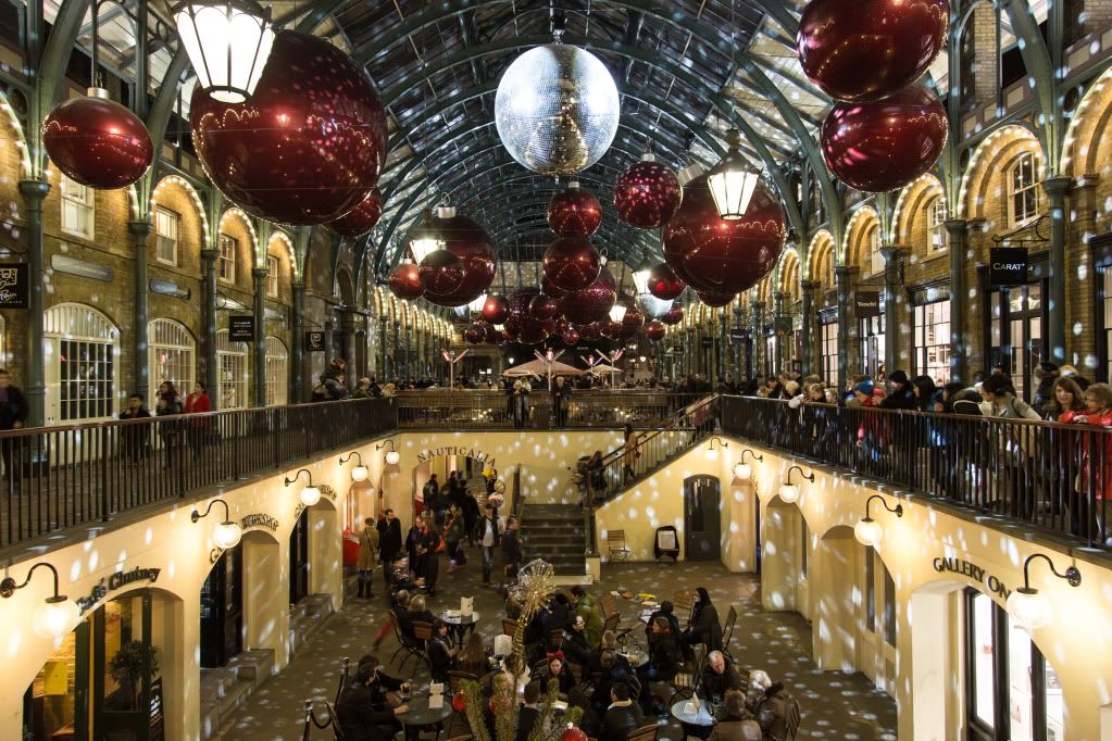
4.
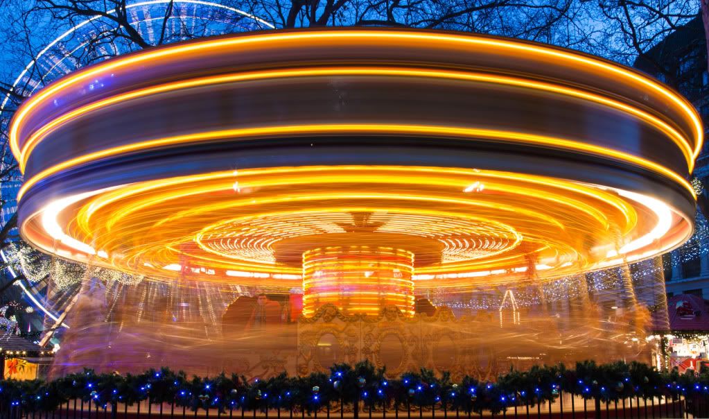
5.
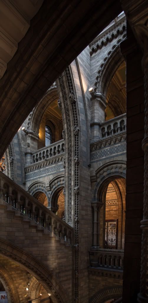
6.

")
 I don't think it works because her face is so in the shadow unfortunately.