Day at the beach

Associate
Joined
11 Dec 2004
Posts
1,979
1)
Day at the Beach.jpg


2)
Waveform.jpg


3)
Layers.jpg


4)
Sentry.jpg


5)
Sign.jpg


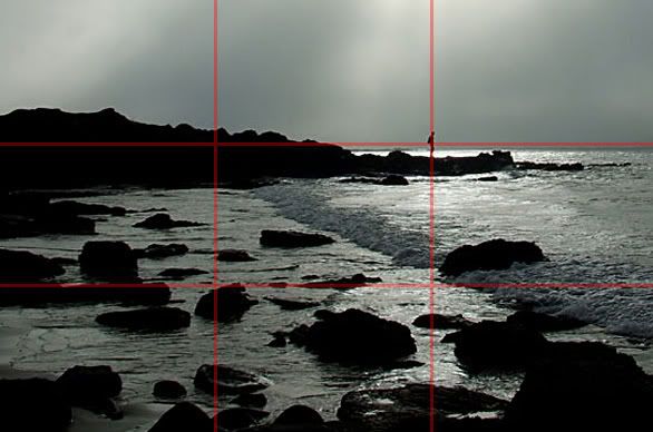
Went for a wander along Gullane beach tonight, took these, among over a hundred others. Took quite a few in RAW for some HDR experiments, but my PC has now decided it doesn't like RAW. I'll have to get that fixed. Also, I've managed to make these pics really small...to see the full size versions, copy the URLs into your web browser and remove the 'Small'.

Using a new border on these too, with an inner white line. I'd appreciate opinions on this, compared to my 'standard' borders of late, as can be seen in the link in my sig.
 
First thing I noticed is that your horizons are way off on all of them. Also they horizon is bang on central in most which is often not a good thing.

They don't do a huge amount for me but 4 & 7 stand out. I think 7 could have been better if the head didn't meet with the horizon and 4 could have been better if the person hadn't been so central.
 
Nice pics, looks like your weather was better than what we have!

Just a couple of comments -

Number 4 could do with rotating clockwise a bit to level out the horizon (did the person jump after the photo ? :D)

I like number 5 but there is something about the post that bothers me. Perhaps if it was slightly more to the left and slightly up a bit, I'm not sure.
 
ranarama said:
First thing I noticed is that your horizons are way off on all of them. Also they horizon is bang on central in most which is often not a good thing.


The horizons are indeed off on some of them, but that doesn't actually bother me, and I didn't even notice. The fact that they're central is also something I didn't even notice tbh, and your objection to that seems to be based on principle, which I don't quite understand. Unless you mean that they specifically detract from the images in some way?


drunken fool said:
Number 4 could do with rotating clockwise a bit to level out the horizon (did the person jump after the photo ? :D)

I like number 5 but there is something about the post that bothers me. Perhaps if it was slightly more to the left and slightly up a bit, I'm not sure.


Fair enough, the horizon on 4 is ever so slightly out. Ahem. :o


As for 5, you think the post is perhaps a little too central? It was more of a snapshot than anything else, and in hindsight, it would probably have looked pretty good with the rest of the beach in the background (ie if I'd moved a few steps left and turned the camera a little to the right).


More like this, perhaps, for 4?


Sentry-level.jpg


To be honest, I quite like the slant. :o
 
tTz said:
The fact that they're central is also something I didn't even notice tbh, and your objection to that seems to be based on principle, which I don't quite understand. Unless you mean that they specifically detract from the images in some way?

An image will generally be more aesthetically pleasing to most individuals if it follows the 'rule of thirds' which suggests placing important features along a third of the image. In this case having the horizon a third of the way down, with more foreground would probably have benefited them. If there is a very interesting sky then a third from the bottom can work well. This also works well with the objects of interest, say placing a tree a third from the the right of the frame in a landscape shot.

edit - kinda like this...

thirdsrule.jpg


...with patronising lines and all :p
 
Last edited:
tTz said:
The horizons are indeed off on some of them, but that doesn't actually bother me, and I didn't even notice.

<snip>

To be honest, I quite like the slant. :o

The trouble is, I assume that you are not simply taking the pictures for your own amusement since you are sharing them with us. For most people (myself included) the horizon is one of the key points of reference in a photograph, and if it has water meeting sky at a rakish angle it just looks wrong.

Because we all know that the sea doesn't slope, when we see it do so in a photograph it is sufficiently disconcerting to distract the eye from anything else.

The rule of thirds has already been explained. I will only mention the fact that this has been recognised as the most aesthetically pleasing way to compose a picture for hundreds of years, and if you choose to compose a picture differently it should be after careful thought and not done as a matter of course.
 
Nicos Rex said:
The rule of thirds has already been explained. I will only mention the fact that this has been recognised as the most aesthetically pleasing way to compose a picture for hundreds of years, and if you choose to compose a picture differently it should be after careful thought and not done as a matter of course.


I already know the rule of thirds, though I thank divine-madness for taking the time to explain and illustrate it anyway (even with the patronising lines :p), but I don't see why it's treated as gospel fact by so many people. And in truth of the matter, I am taking pictures for my own personal amusement and gratification more than anything else, I'm just sharing the ones that I like, to the deafening sound of indifference. ;)

I prefer the composition of my image without the rule of thirds cropping as done by divine_madness. I think having the person in the middle of the image look better than at the side, it makes him stand out more. Plus, with more of the sky, there's more of the rays of light that were behind him (which I miserably failed to capture properly, though I'm hoping the RAWs might yield more success, if I get them working), and I wouldn't crop the foreground too much because I quite like the way the leading edge of the wave draws the eye to the person silhouetted on the horizon.


I know it's all opinion, and I should point out that I've always taken pictures at wierd angles. I've been doing it so often on purpose, I tend to do it by accident too. Things just seem more interesting with strange perspectives, it requires a little more thought to decipher. So, given my predisposition towards bizarre angles and perspectives, I may be a little biased. :p
 
tTz said:
I already know the rule of thirds, though I thank divine-madness for taking the time to explain and illustrate it anyway (even with the patronising lines :p), but I don't see why it's treated as gospel fact by so many people. And in truth of the matter, I am taking pictures for my own personal amusement and gratification more than anything else, I'm just sharing the ones that I like, to the deafening sound of indifference. ;)

I prefer the composition of my image without the rule of thirds cropping as done by divine_madness. I think having the person in the middle of the image look better than at the side, it makes him stand out more. Plus, with more of the sky, there's more of the rays of light that were behind him (which I miserably failed to capture properly, though I'm hoping the RAWs might yield more success, if I get them working), and I wouldn't crop the foreground too much because I quite like the way the leading edge of the wave draws the eye to the person silhouetted on the horizon.


I know it's all opinion, and I should point out that I've always taken pictures at wierd angles. I've been doing it so often on purpose, I tend to do it by accident too. Things just seem more interesting with strange perspectives, it requires a little more thought to decipher. So, given my predisposition towards bizarre angles and perspectives, I may be a little biased. :p

You make a number of well argued points, which deserve a reasoned rebuttal.

You are aware of the rule of thirds and choose not to follow its precepts. That is all well and good, since it is certainly not meant to be set in stone and such creative decisions are the stuff of art. You are also able to explain and defend that creative decision, which is even better.

Sadly, much of this smacks of a justification made after the event. You have 4 compositions with a horizon in them and in each it slices the frame in half at a slight angle. One shot like this would suggest that you had thought about it and planned it that way, all 4 tell a different story.

You say that you like weird angles and odd perspectives. So do many people. If I see a seascape with the horizon at 30 degrees, I realise that this was done deliberately and for effect, when I see 4 shots with a horizon just a few degrees off you will forgive me if my instant reaction is to think that the photographer has been a bit careless.

You are not hearing a deafening sound of indifference - it is closer to exasperation since you have a good eye for a picture whch is marred by sloppy and eccentric composition.

I agree with NuclearWinter, shot number 3 is the best of the bunch. Interesting textures and colours, and a pleasing composition - well done!
 
NuclearWinter said:
Have to say that the crop posted by divine_madness seems a nice improvement to me.


On this one, I still stick to my guns. While my horizon comments were more of a defence against criticism that I didn't like, I still think having the person in the middle draws more attention to the person. With the person slightly to the side, I don't feel that my eye is drawn naturally to him. It also looks a little too dark without the sunlit sky, in my opinion, but that's all down to taste.


divine_madness said:
Because 99% of the time it does make for a far more aesthetically pleasing composition. :p


I'm always in the minority. :p


Nicos Rex said:
Sadly, much of this smacks of a justification made after the event. You have 4 compositions with a horizon in them and in each it slices the frame in half at a slight angle. One shot like this would suggest that you had thought about it and planned it that way, all 4 tell a different story.


And in all honesty, I must admit that you're right. It wasn't planned, and it was more the fact that I take unusual angles (I quite like the term 'eccentric', as you used :p) all the time and didn't bother checking for a 'normal' angle. I didn't think the angles were bad in the other ones, other than 7. In 1, the horizon looks a little dodgy, but I think that really is down to the slope of the land and the slope of the beach - I actually took a ruler to this image to check. Beaches, unlike oceans, can indeed slope, and this one definitely did. I didn't think the horizon in shot 5 was too bad either. I agree that all the horizons slice the images near enough directly in half, which was another accident, and I'll take care over that in the future. I think if I stop taking snapshots and start taking photographs, I might be getting somewhere. :o


Also, sorry if I seemed a little snappish or arrogant in my last post. It's been a long, hard day, and I wasn't in much of a comprimising mood, when I should've been more open to the opinions of much better photographers. And that's not me brown-nosing, that's me acknowledging that photography maybe requires more than a snap-happy attitude. And that was bloody hard to admit. :p


Nicos Rex said:
You are not hearing a deafening sound of indifference - it is closer to exasperation since you have a good eye for a picture whch is marred by sloppy and eccentric composition.

I agree with NuclearWinter, shot number 3 is the best of the bunch. Interesting textures and colours, and a pleasing composition - well done!


Thanks for that. Less of the eccentricity in the future, methinks. I liked 3, I just wished the sky had been blue or something...the white looks a little blown out. The rocks were fantastic to look at - the ones in 6 especially were amazing, and the image really doesn't do them justice at all.
 
Glad you got the point!

As for "snappish" I am sure that no pun was intended :D It can be unpleasant when total strangers pick holes in one's work and it is a natural reaction to be a tad defensive.

I think that you have already twigged what you have to do to improve the standard of your work, the big clue is here:

took these, among over a hundred others

OK, there is a degree to which you need to take a lot of photographs to get a few good ones but it seems to me that you need to use your index finger a bit less and your eye and brain a bit more!

I have been taking pictures for about 40 years, and when I started with a Kodak Brownie 127, I had 8 shots to play with and I could afford 1 roll a week by walking a couple of fare stages instead of taking the bus on the way to school every day. (D&P not a problem as I could use the darkroom at the family business). I think that digital media have a lot of advantages, but fostering a degree of discipline is not one of them!
 
Nicos Rex said:
OK, there is a degree to which you need to take a lot of photographs to get a few good ones but it seems to me that you need to use your index finger a bit less and your eye and brain a bit more!


Go tell that to messiah_khan! :p

I get the point, but there were a lot of other ones that I considered 'good' in there too, not just those 7. I took a lot of images of the rays of light with different settings to try to get them (and failed) so that accounted for about 30, and spent ages trying out long exposure settings to get that kind of 'milky water' look. Again, I failed...too much sun. Bleh. So maybe 50 of those pics were trial and errors, a luxury of digital. ;)

But yeah, I get what you mean. Like I said in the last post:

tTz said:
I think if I stop taking snapshots and start taking photographs, I might be getting somewhere.


So thanks for the advice, and I'll take it on board. :)
 
Back
Top Bottom