

Hey all,
I've recently redesigned our corporate site at work. It's a departure from our normal style and as such I'm getting quite a bit of resistance to the changes.
Primarily, I think it's the font, so below I've included a few different font examples and I'd appreciate your comments, i.e. which you prefer the look of. A bit of lenience for the sans-serifs might be needed as the site was designed with Georgia in mind. Also bear in mind our industry and the other typical sites you would associate. Comments over the old site would also be welcome, amttraining.com.
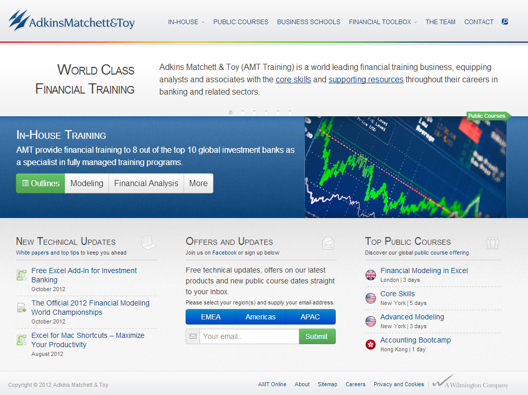
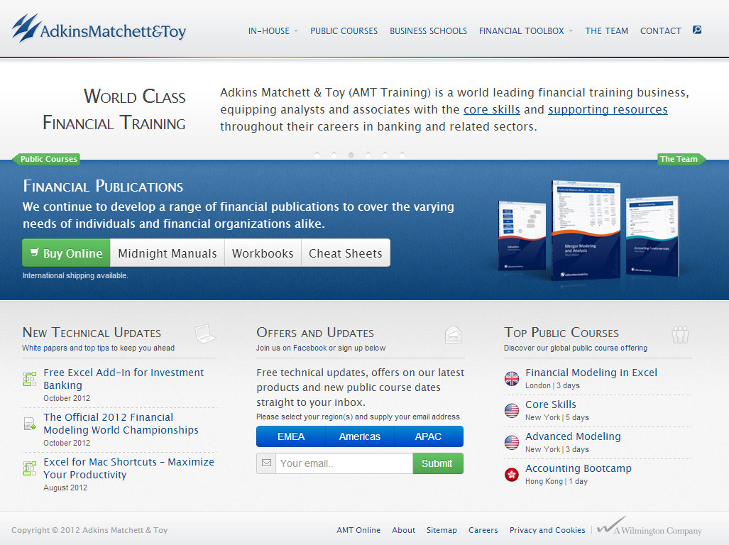
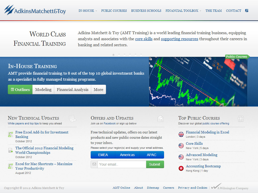