Soldato
- Joined
- 4 Nov 2004
- Posts
- 4,220
- Location
- Seattle area, USA
So iTunes 10 is out, some nice new updates and all that. 
But what's this?! Awful new blue colour logo?


Yuck!
So I decided to change it. Open up Acorn (using the free version).
Go to 'filter' > 'color effect' > 'color monchrome'.
Select a grey colour in the colour select box.
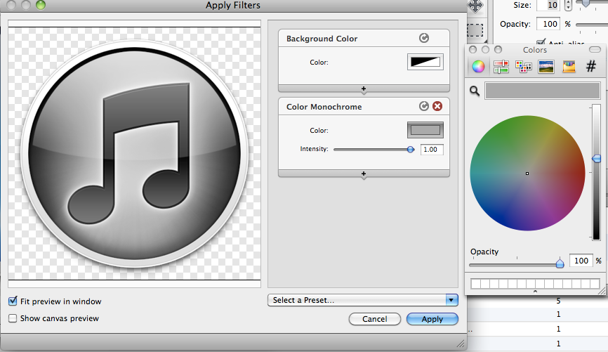
Click 'apply'.

Much nicer. Save as a .png.
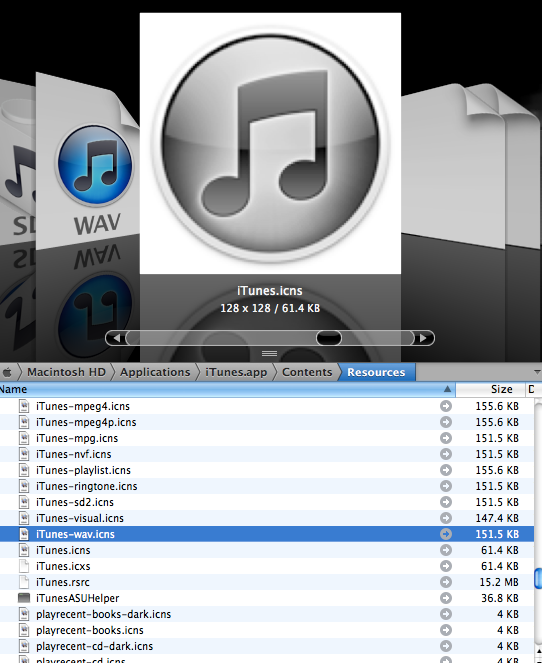
Download FastIcns. Save as a .icns file
Move it inside the 'contents' > 'resources' folder of iTunes.

Be happy.
Original file
New file
But what's this?! Awful new blue colour logo?
Yuck!
So I decided to change it.
Open up Acorn (using the free version). Go to 'filter' > 'color effect' > 'color monchrome'.
Select a grey colour in the colour select box.
Click 'apply'.
Much nicer.
Save as a .png.Download FastIcns. Save as a .icns file
Move it inside the 'contents' > 'resources' folder of iTunes.
Be happy.
Original file
New file
Last edited:

")