Improving the look of the 2012 F1 cars

Man of Honour
Joined
29 Jun 2003
Posts
34,579
Location
Wiltshire
So how could the improved generation of 2012 cars look? It’s over to graphic designer Jeremy Hancox who’s already posted some excellent designs in the forum.

First up Jeremy tackles one of the least attractive cars on the grid. Ferrari told us the F2012 would look pretty when it won a race. It turns out they were wrong – what it really needs is a break from those restrictive 2012 rules.

Note that these designs don’t obey the proposed new technical rules to the letter – they’re just intended to show how the current cars would look if the key offending passages of the rules were tweaked.

http://www.f1fanatic.co.uk/2012/03/30/improving-2012-f1-cars/

I like some of the livery designs they did :)
 
I like all of those, can't decide which is my favorite - they all look 100 times better than the real counterparts.
 
Has that guy just made the F1 2012 cars look better by.... ignoring the nose height rule? Lol.

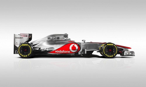
Waste of time if you ask me, there is already a great example of how to make a 2012 F1 car look good:

mclaren-mp4-27-3.jpg


:D
 
The black McLaren on is epic. Its a colour scheme that has been rumoured for a few years, every since Mercedes came back and people felt they would take the chrome away from McLaren and use it themselves.
 
I know I'm a bit biased but I really do like the look of the redone Ferrari livery, harks back to the late 80s early 90s era with the red and black.

They all look beautiful, such a shame that they all didn't go the McLaren route with regards to aero, as much as it pains for me to say it :p
 
Back
Top Bottom