Katy

Associate
Joined
19 Oct 2005
Posts
1,123
Location
Chelmsford Essex
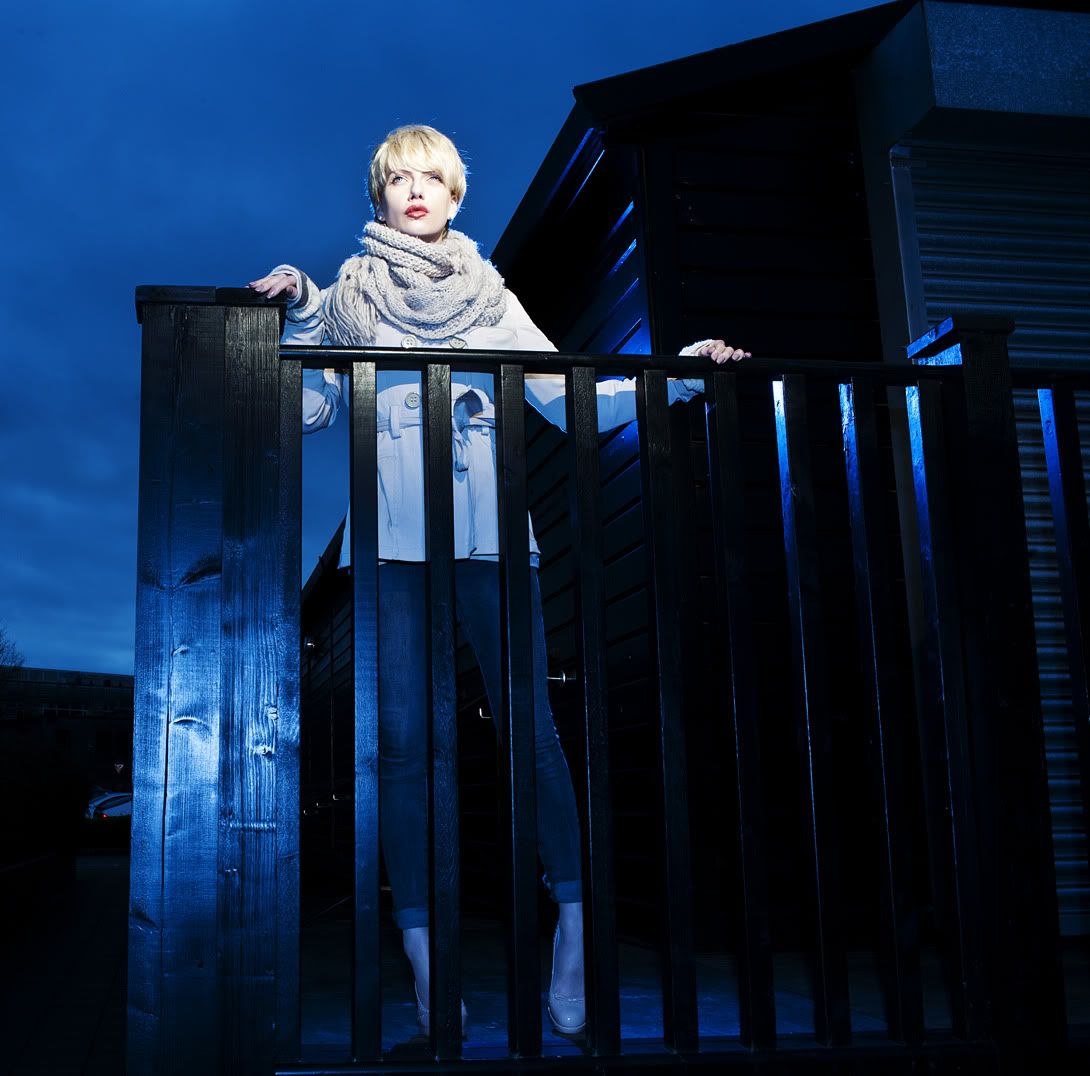
Haven't posted much of late - picture wise. Anyway thought I'd get back in the groove and do a Lovegrove course again. Here's a couple where I went of reservation lol!

More on the blog here http://www.paulbeggyphotography.co.uk/Blog/?p=141

Enjoy!

1.
DSC_9424.jpg


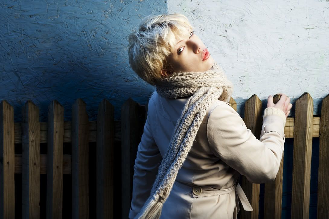
2.
DSC_9477.jpg


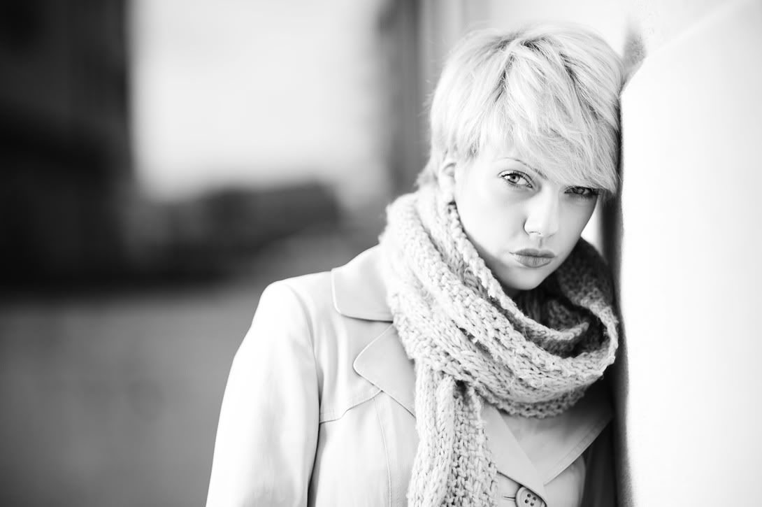
3.
DSC_9475.jpg
 
Thanks for the comments guys all appreciated :)

Did consider coming in tighter on 2 in the crop but I couldn't get it to look right! As always personal taste haha! I'll have another go and post up and see what you guys think!

Cheers

Paul
 
She's a very attractive girl, she doesn't need to pout nearly half as much as she is doing. She looks like she's got more than enough 'lip' anyway!

The 3rd looks very forced, I'd drop that one. Otherwise first and second are nice. First is a bit, model against wall (You know what I mean? That common kinda pose) but I think the only thing that needs changing is her pout, you've done nothing wrong there. Second is a much more interesting shot, get rid of the fly aways around her head and a bit of retouching around her lips (her lower lip looks like it's kinda dripping at the middle like paint) would be good. I'd possibly take her down a little bit and have it a little less blue, but that's entirely subjective. I'd also remove the little distracting things (metal bits around her knees, and those cars in the background).

Very retouch focused comments but I think that's all that needs changing :)

Cheers Fella.

Funny I didn't really notice the pouting until you guys picked up on it lol! It's almost part of her look if that makes sense - going through the pro and non pro shots on her Facebook it seems a characteristic of hers. Even the pics she's had in Vogue have a similar look lol!

@Op

These shots are ok imo, but nowhere near as strong as some of the shot's you posted of her on your blog. There is some really good stuff on your blog, but your weaker images will detract from them, so imo a few need to be removed.

Edit:

Example:

The below looks better than No. 3 imo, If you agree also, then I think No. 3 should be binned from the blog as it doesn't portray your work in it's best light.

DSC_9472.jpg


Edit 2:

If you left enough space then I think this would look even better in a vertical crop, if not, crop tighter, and also try some highlight recovery to stop her left cheek almost bleeding into the white background.
Also having read the blog about the light setup, imo it could have been better placed as to not expose the hands and background so much (ideally they should be less exposed than the face, otherwise they distract), putting a grid on a softbox helps this, and allows for more control of 'what' you illuminate.

Edit 3:
This one is the best imo, nice use of a rim light + Fill.
Thanks for the feedback and tips there I'll think about grids etc in the future, something else to learn about which is always a good thing! :)
 
Back
Top Bottom