Westyfield2 said:
Don't have a clue whether it's what you wanted, but to do that I used a Levels adjustment layer, a Hue/Saturation adjustment layer, a Brightness/Contrast adjustment layer, and a Curves adjustment layer. (All in CS2).
what advantage do adjustment layers have over using image>adjustments. hang on.. it means i can alter them back if i want doesnt it. like if i desaturated the whole image, and then changed my mind - increasing saturation wouldn't bring colour back - but if i used an adjustment layer, it would still have the slider over to the left and i could just slide it back, yeah?
drunken fool said:
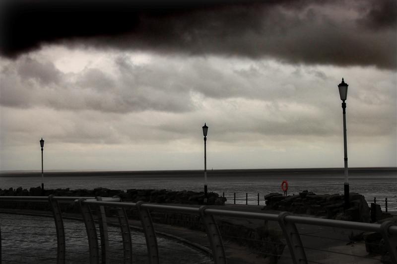
to be honest, the top of the sky looks to over processed compared with the rest of the shot. To me it just stands out more than anything else
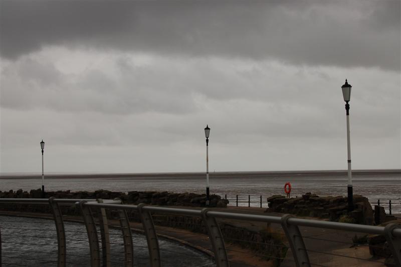
the way i'd been working, was using the magnetic lasso to select areas (like the top end of the sky) then feathering it, pasting it into a new layer and then messing with it. the very top of the sky has been blurred in attempt to hide some noise that was showing through. it didnt work very well!
ChroniC said:
My quick examples are basic contrast, colour, shadow and lighting, on seperate parts. A colour filter on the sky, and some blending of layers.
i've been trying to use layers, and am started to get used to them now. I'm lost on what the all the different ways of blending them acheive. I've looked around for guides and the like, but they all just say 'use X blending method' but don't tell me why, or what it is exactly doing.
xolotl said:
What's going on around the orange life saver? On almost all of the pictures there is some very dodgy artifacting on it.
As for the processing you've done I'm not a fan. The picture just looks under exposed instead of moody and atmospheric.
It cropped up when i resized the image to post it here, i should've used photoshop for the resize i think.
I know it aint perfect, hence the thread - i also regret not totally desaturating the image (orange bit aside), i left a tiny bit of colour in there.
thanks all the comments and help guys, much apperciated. I'll have another play in a bit and post what i come up with.


")