Making the move from xp to win 8.1

Associate
Joined
4 Nov 2011
Posts
512
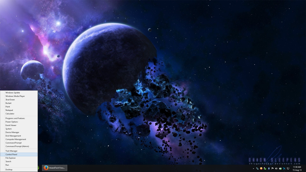
As somebody who is totally unfamiliar to window's 8 is there any tips to set it up for work like the regular XP, with start menu and normal desktop with the my computer so i can easily access my hard rives and find all my files? I don't like the look of that metro thing at all, i don't even use iphones or ipads which it looks similar too, i just want my basic desktop with program files and direct link to my hard rives with my files etc. Ive never used windows 8 or 7 so i have no idea what to expect ive just read lots of horror stories but no idea if its really as different and confusing as people make out.
 
Its not really that different, start screen can be a little confusing at first, its just depending on your useage style not quite as quick and efficent to get to certain things (again depending entirely on your approach to the OS).

Turn off charms, configure the system to boot straight to desktop and install a 3rd party start menu replacement and you'll be mostly back to what you expect though you'll still have to deal with the mess they made of explorer and the cheap knock off looking Windows UI (which can also to an extent be reskinned to look more like older windows using 3rd party programs).
 
is there any tips to set it up for work like the regular XP

Why would you want it to work like an outdated relic of an OS? I can understand the familiarity aspect, but a lot has happened in the last decade and computing is much better for it, Metro or not.

There is a few third party apps like Start is Back to make it more Windows 7 like... but even then, why? Just try it for a while, maybe you'll like it :)
 
Why would you want it to work like an outdated relic of an OS?

Same can be levelled at Windows 8 :P people seem to forget that Windows 3.xx was not entirely unlike the way Windows 8 works albeit far more rudimentary and lacking live tiles and there was a reason that style was ditched for the start menu model.
 
Don't forget the favourite shortcut Win+X menu ie right click in bottom left corner and you get this,


cp2_zps5ba050ed.png
 
I've never found that feature very useful as it only goes half way towards what a start menu provides and on a tablet means long pressing to get the right click which kind of defeats half the purpose of quickly getting to stuff.
 
It's slightly confusing to begin with but nothing that warranted the hysteria. 8.1 (and its update) are a lot friendlier and more polished out of the box. File management is no more difficult than XP and explorer is miles better.

If you like the start menu just install one as suggested. It really is that straightforward.
 
Only thing about explorer that is better is the copy dialog, the interface itself is a mess of random quick and context sensitive menus that appear in weird places whenever they feel like it and completely defeat the purpose of having quick menus, a myriad of different functionality without a uniform approach to similiar things and a clunky awkward approach to things that just worked in previous versions without any drama or fuss.

http://imgur.com/8fvcPbu - Windows 8 (granted on a 8" touchscreen so the scaled stuff to make it more usable emphasises the bad)

http://imgur.com/5CVWBvN - Windows 7 on an old laptop I'm using at the mo
 
Last edited:
http://i57.tinypic.com/97uuwz.png
As for me, I'm actually fond of the options that appear once View is clicked. Especially the show/hide check boxes. I'm just not keen on my mouse moving over the layout selections which causes my folder/file icons to momentarily grow and shrink.

@OP, I'd try Win8.1 as it is for yourself to see if "you" like it. If not, you can try Startisback to modify the interface to something more familiar.

I once had Win8 just sitting on a disc whilst being determined not to install it because of all the drama. I only installed it to activate the free WMC key I had at the time before it expired. Turns out I actually liked the OS. My brother just got his new laptop last week with W8.1 and is using it without any quarrel: "On the Internet they said W8 is rubbish!"

How well does W8 coincide with your personal habitual use of your computer? You'll find out for yourself.

BTW you're able to create shortcuts to drives on your desktop and start screen in W8.
 
Only thing about explorer that is better is the copy dialog, the interface itself is a mess of random quick and context sensitive menus that appear in weird places whenever they feel like it and completely defeat the purpose of having quick menus, a myriad of different functionality without a uniform approach to similiar things and a clunky awkward approach to things that just worked in previous versions without any drama or fuss.

http://imgur.com/8fvcPbu - Windows 8 (granted on a 8" touchscreen so the scaled stuff to make it more usable emphasises the bad)

http://imgur.com/5CVWBvN - Windows 7 on an old laptop I'm using at the mo

On my Windows 8.1 explorer looks pretty much as your Windows & version does, yep I can make it look like the other one but to me it looks pretty much as explorer always has done.
 
I've never found that feature very useful as it only goes half way towards what a start menu provides and on a tablet means long pressing to get the right click which kind of defeats half the purpose of quickly getting to stuff.

All relative since its more useful for desktop users,besides tablet users would use Metro Start for their most useful features I know I would.

Personally I always thought Win+X menu was more designed for PC desktop users anyway.
 
Only thing about explorer that is better is the copy dialog, the interface itself is a mess of random quick and context sensitive menus that appear in weird places whenever they feel like it and completely defeat the purpose of having quick menus, a myriad of different functionality without a uniform approach to similiar things and a clunky awkward approach to things that just worked in previous versions without any drama or fuss.

Well, I have to disagree on that point to be honest. The only inconsistency you have to get used to is that fact that the menu is context sensitive, which isn't the same as randomness. The Windows 7 Explorer also has a context sensitive menu bar, it's just a lot more basic and draws less visual attention. I bet a lot of people don't even notice it. I find it a lot easier to work with when the ribbon is pinned open, though. Having to expand it each time is fussy.

Search via Explorer is a lot more convenient, and between the return of the "Up" button and the ability to mount ISOs and VHDs natively, I still think Explorer is a lot better than it was. I've also not found many (if any?) XP/7 era conventions that don't work in the new Explorer e.g. context menu options.
 

Funny how people are so quick to forget the past :P

Well, I have to disagree on that point to be honest. The only inconsistency you have to get used to is that fact that the menu is context sensitive, which isn't the same as randomness. The Windows 7 Explorer also has a context sensitive menu bar, it's just a lot more basic and draws less visual attention. I bet a lot of people don't even notice it. I find it a lot easier to work with when the ribbon is pinned open, though. Having to expand it each time is fussy.

Search via Explorer is a lot more convenient, and between the return of the "Up" button and the ability to mount ISOs and VHDs natively, I still think Explorer is a lot better than it was. I've also not found many (if any?) XP/7 era conventions that don't work in the new Explorer e.g. context menu options.

You get various "quick" toolbars popup in the top left of the title bar on an explorer window, then ever changing context menus popup in the middle of the titlebar - both of which are somewhat lacking in uniform behaviour for similiar usesages, then you've got the badly implemented ribbon tools below that - which sure can be hidden but then you make life more difficult for yourself for some things that can only really be used from there but you often have to filter out a lot of duplicate/redundant functionality to find what you want. Then you get other context specific "quick" toolbars that only appear in special folders and/or when certain files are present - all in all it defeats the point of any "quick" functionality or the usefulness of case sensitive features. Its hilariously bad design infact and breaks quite a lot of the simple "rules" for good UI design.

Then you have the whole multi-select thing which doesn't even work properly half the time.

Sure there are some nice extra features like the far better copy dialog/functionality and some better handling of things like ISOs but that doesn't change the other stuff which seems to have been mostly changed for the sake of it from things that simply weren't broken in Windows 7 and simply worked as intended with no fuss.
 
I don't know what to say really because that's not my experience (keyboard & mouse) both personally and support-wise. People seem to be instantly familiar with Explorer in 8.x and at the same time it surfaces a lot of functions that were previously hidden behind context menus. And as you say, you could just hide the thing.

But that's cool, different strokes etc.
 
Dunno I just come from a really compact but completely functional version in 7 and can't seem to get the same in 8 - keeping it compact loses a lot of functionality, getting the functionality comes with a price of lots of extra UI "noise" and not a great deal inbetween :S

EDIT: Goes beyond that though (granted a certain amount can be sorted with 3rd party apps) but in Windows 7 I have nice smooth window bevels, gel/transparent buttons and icons and window handles/tools. etc. in Windows 8 they just look plain nasty and like you'd expect in a knock off version of an OS.
 
Last edited:
I quite like the flat UI although it can suffer from being a bit low contrast at times. It can take its flatness a bit literally in places and certain elements don't stand out enough.
 
Back
Top Bottom