MY EYES!!!!
Its rancid!!! The pictures are all blocky, theres no smoothness like the other one!
Oh, and how do you get mini display pics back? I cant find the option. I'm just stuck with the generic messenger guy for all contacts..
Want to elaborate on what you find good? Its 'nice' but needs a lot more refining in my opinion.
I had just got used to only seeing one display pic at a time, and now its been removed totally! That was the neatest feature in 7.5.
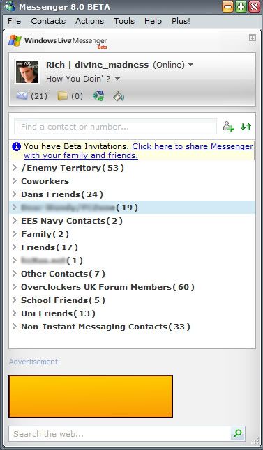
Secondly, uncollapsed groups only contain the number of contacts in that group in the headding. It should also display how many in that group are online.
They've really botched the whole Online/Total thing.
I want to be able to see all my contacts with the online ones highlighted with a different colour like before, now I can either see them all but looking identical or just the online ones. It's stupid.
Want to elaborate on what you find good? Its 'nice' but needs a lot more refining in my opinion.
I had just got used to only seeing one display pic at a time, and now its been removed totally! That was the neatest feature in 7.5.
Secondly, uncollapsed groups only contain the number of contacts in that group in the headding. It should also display how many in that group are online.
They've really botched the whole Online/Total thing.
I want to be able to see all my contacts with the online ones highlighted with a different colour like before, now I can either see them all but looking identical or just the online ones. It's stupid.
This site uses cookies to help personalise content, tailor your experience and to keep you logged in if you register.
By continuing to use this site, you are consenting to our use of cookies.


")