New Rolex model - Yachtmaster II

Don
Joined
18 Oct 2002
Posts
42,097
Location
Notts
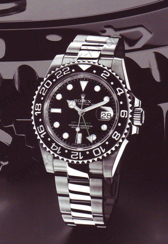
Rolex are not ones to launch a new model often preferring to evolve watches ( the Submariner is over 50 years old ) so a new model with new movement is quite a thing

They have just announced the new Yachtmaster II , just curious on peoples opinions, technically it looks good but I am not conviced re the aesthatics

MasterYuck.jpg


The yellow gold version is truly shocking

b07rnsc_02.jpg
 
not sure i like it to be honest.

/edit, i like the internal face, hands and dials, but i think its the case which puts me off.
 
Yellow/gold is technicolour yawn-inducing. The other is too busy but is slightly better. Don't like the numbers around the outside of the face.
 
I'm sorry but that is not my cup of tea at all. To me it looks like it was designed but those people that make £20 watches. it just looks cheap and tacky
 
Maybe that looks better on the wrist, but my feelings are that its just nasty. Take away the Rolex badge and it looks cheap, sorry but thats not got any impact. :/
 
Rotty said:
The yellow gold version is truly shocking
OMG it really is tacky. Gold lettering on blue is just vile, not a fan of red hands on a white gold case and a white dial either.
 
Not a good idea at all, imho. Rolex have succeeded by not having fashion watches, which always date very quickly. This looks like a notable exception - not sure why you'd go for this when you can get a GMT Master II for about £2.5k :)
 
Nasty, looks really tacky - with YACHTMASTER II on the front to scream it at people. Might was well tattoo I CAN SPEND £20k ON A WATCH, I AM RICH!

I like expensive watches and if it's something subtle and engineered properly with good materials then £20k is fair enough but this just looks like it was built to show off.
 
Rotty said:
They have just announced the new Yachtmaster II , just curious on peoples opinions, technically it looks good but I am not conviced re the aesthatics

Reminds me of a Roger Dubuis easy diver for some reason. Not a fan I'm afraid. Still only one Rolex on my list and thats the Daytona.
 
Gilly said:
Yellow/gold is technicolour yawn-inducing. The other is too busy but is slightly better. Don't like the numbers around the outside of the face.

I agree with you on the numbers. Also, why must the model name/number be so large? Surely this detail should be understated, the large chunky letters are gaudy.
 
I'm not sure I'd ever be spending £10k+ on a watch but if I did it certainly wouldn't be one of them, both look overly fussy with too much on the dials and the yellow gold version just screams tacky which is not what I'd be wanting for the money.
 
Back
Top Bottom