You are using an out of date browser. It may not display this or other websites correctly.
You should upgrade or use an alternative browser.
You should upgrade or use an alternative browser.
Rio 2016 logo
- Thread starter Craig R
- Start date
More options
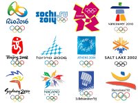
View all postsThe best design creates debate. Take that from an actual graphic designer, not an armchair critic. It doesn't matter whether you like it or not - how many previous Olympic logos can you remember? They've always been about washed out brush strokes and boringly predictable stereotypes. At least this did something different.
http://99designs.com/designer-blog/2012/08/14/in-defense-of-the-london-2012-olympic-logo/
It broke new ground, it created a distinctive brand and it got people interested in design. What could be better than that?
People debating over whether it looks just a bit ugly or if it is a true design abomination isn't really an indicator of good design.
so you are talking out of your backside, then?
The Rio logo represents unity (people holding hands), Brazil's culture of colours and dancing (colourful, people dancing), and it EVEN BLOODY SPELLS RIO (it spells Rio!).
London one? Seen better scribbles.
Exactly this. The London one was just some crudely drawn shapes that said nothing about anything.
The 2012 one is truly iconic end of, same as Coca Cola, Intel, IBM etc. The Rio one is just another logo..
It's great that you are able to look in to the future and see how the London logo is remembered lovingly as a design classic.
The London logo and its branding definitely isn't what I'd call beautiful (the typeface for the games is horrid too), but it's a very effective piece of branding - even when its placed in a sponsor ad and coloured accordingly it manages to remain distinct and recognisable. Wolff Olins managed to give the games an actual identity rather than follow in what people expect from Olympic branding. A logo doesn't necessarily have to be relevant to the company, it just has to be recognisable enough for people to associate it with the company.
The Olympics has so much exposure that it is pretty impossible to make it unrecognisable, no matter what the logo looked like.
It could have been a stick with a jobbie on the end of it and it would have been recognisable with the London Olympics if that is what they had plastered everywhere.
It stands out as being an eyesore.


