some constructive criticism, please :)

  • Thread starter Thread starter uv
  • Start date Start date

uv

uv

Soldato
Joined
16 May 2006
Posts
8,435
Location
Manchester
Howdy..

Just re-designing the graphics for a Lan I run, and I'm thinking of going for the concept below:
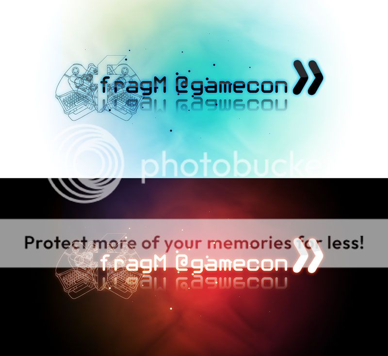
Untitled-1.jpg


Which do you prefer? Do you hate it, and if so why? :p

Yeah yeah, I stole the outerglow effect from a tutorial site, but I like it so meh :)
 
The second is nicer, but then the first is just an invert of the second, so it naturally looks as such.

The arrows to the right look a bit out of place, perhaps move them down or shrink them, other then that though... pretty dam good!

Would look pretty cool on a black t-shirt if you pulled in the red blob background (otherwise it will clip - as it is in the image above). I'd assume the black is just the canvas colour.
 
bah, so it's about 50/50 :p

Will take a look at reducing the arrows/reflection :)
 
Make the arrows the same height as the letters, drop that reflection and they are both rather cool :) First one suits the use better imo though.
 
First one, cropped to be the letters/logo + a bit of padding, would be best on a website. I don't like "dark" websites.
 
Hi,

I prefer the white background, it is clearer I think the keyboard etc looks a little cluttered though. Although they are very nice outlined images, just a bit too much going on for me. The typface works quite well, though if it is in photoshop maybe try and deconstruct it a little. Fall in line with the expression 'Frag', maybe a few bullet holes still hot from a shell travelling through it? cut it up a little? My two bits aside It does the job as is though fella. Just adding a bit of input we all love and desire. The white version, maybe knock back the keyboards etc if you don't want to remove any of the elements or details. That way the 'F' stands out a bit more too, maybe thicken the stroke weight of the 'F'

Cheers

B
 
Back
Top Bottom