

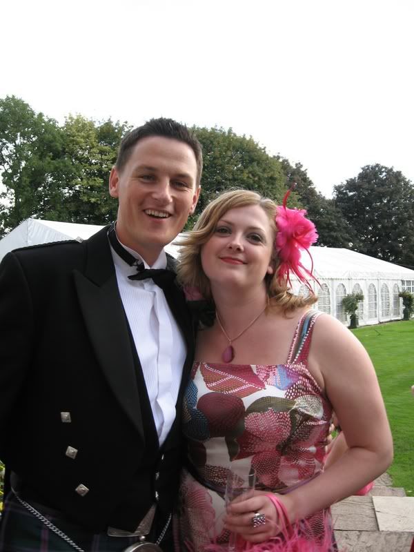
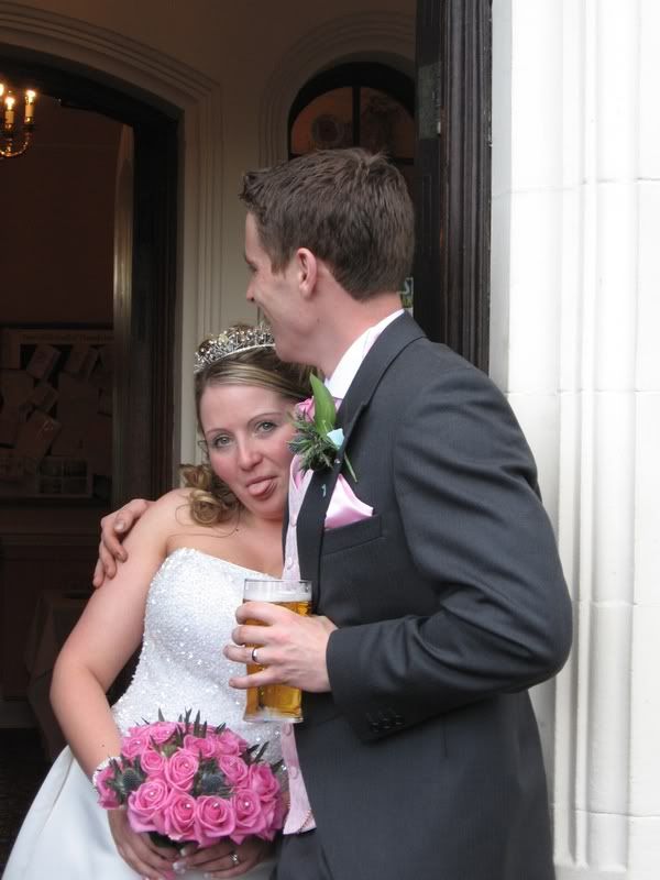
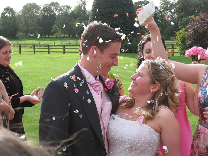
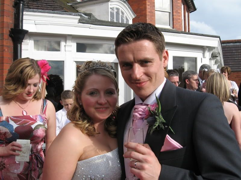
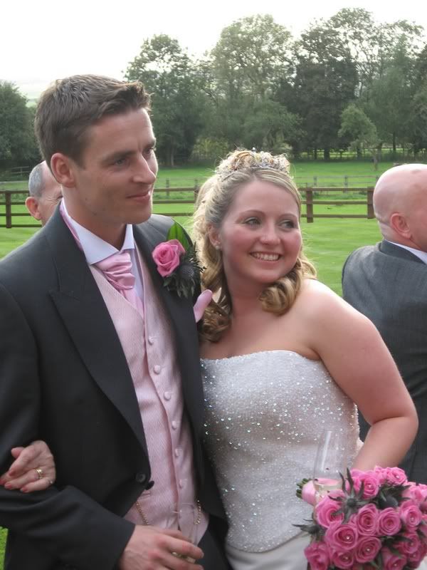
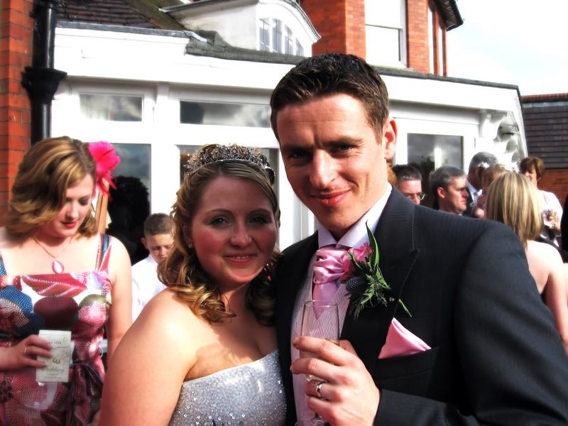
ok guys was my brothers wedding this wknd and i think i got some quite good shots. couldnt really afford to get him a wedding present but thought some of the shots enlarged on canvas might be nice.
think they need a little touching up in photoshop but not sure what to do with them. ill post the originals and a couple that ive done in ps and any comments and criticisms would be appreciated.
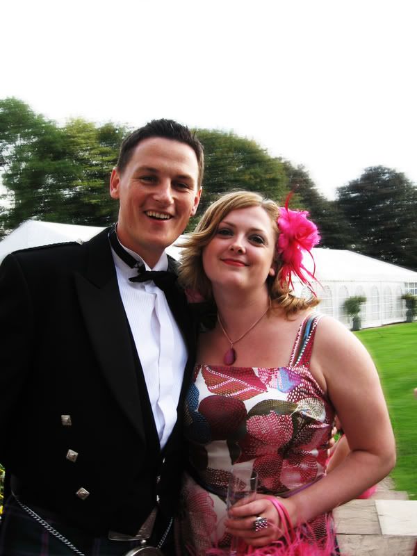
originals: -
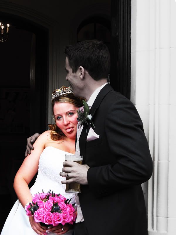
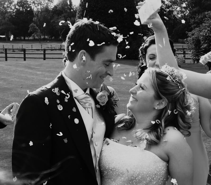
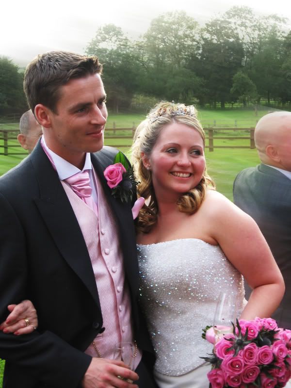
think they need a little touching up in photoshop but not sure what to do with them. ill post the originals and a couple that ive done in ps and any comments and criticisms would be appreciated.
originals: -
")