I fail to see how?
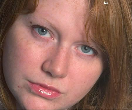
Go back to the original image, they all have a deadly orange cast. I suspect that the image was shot in the house on an evening with the light on. The camera would have been set on auto for white ballance and in all honesty a camera doesn't have a clue. The colour temp on that original image is sky high, and so are the rest of the images. This is how it should look naturally, 5 mins of mild editing and its a million miles in the correct direction. I could go on with this and make it a star image but i'm too busy with my images. Here ya go, natural:


")

 Overexposed looks pretty damn funky in B&W and IR shots. I thought 'Kill Bill'
  Thanks
")