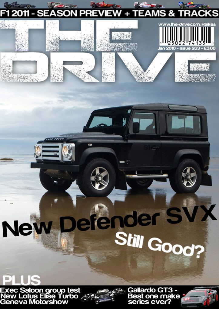
What do you think of this?

The text in the main boxes at the bottom should use the "newspaper alignment" setting, if you know what I mean.
 
the main image suggests to me it's mostly about 4x4's - so not sure i'd pick it up.

Text of "Still good?" sounds a bit.. meh. "Still got it?" sounds more 'punchy'
 
Still is epic, the title is great (is that a certain text, or is it text with splatters brushed over it?) and the F1 part is snazzy.

Don't like the boxes, need to regular and placed in a different location, and as mentioned barcode is just weird there :p
 
Thanks very much for your feedback. In draft 2 I think I have addressed some of the parts that people pointed out. Also, I can't use inDesign because it's expensive and I simply don't have the time to learn a new peice of software, but thanks for the suggestion.

frontcoverthirddraft.jpg
 
Improvement! Barcode is still too big however, and I think the "new defender..." & "still good" text need restyling. I'm not sure, something's just not right about them, perhaps the angles/placement and/or font style?
 
F1 2010 season preview, but you're using a Toyota and a 2009 liveried williams. Obviously one didn't compete last year, would be good to put the main protagonists from last year up I would say. The rest doesn't look too bad though.
 
I think it looks great apart from the "New Defender SVX" "Still Good?" text formatting. Also, I know it's not for Media AS not English AS, but I don't think "Still Good?" is a great title for a magazine article? It sounds a bit bland, how about something like "Is it still the off-road king?".
 
The font style doesn't flow nicely imo I'm finding myself looking at the way its badly kerned rather than reading it through.

It's just an awful font, and you're right about the kerning, look at the gap between the S and the t compared to between the i and the l.

What's the name of that font so I know to never use it?
 
The spacing of the bottom black box text is terricle. The word plus should up with the text below. You shouldnt have the text of a line below touching the line above.

The bar code looks wrong.

The New Defender text is too wide.

The title text cant be touching the edge. You need to leave a margin for print error. That would be on the fold.

As this for a media assignment, adding cuts and bleeds would show you're thinking about the print production side of the design.
 
Last edited:
Barcode is far too big, your headline lacks thought, "still good?" I mean come on you can think of something better.

The black line of content is too small and doesn't have enough content in it, what is there is in to big of a font and looks squeezed in.

Hope this helps :D
 
Back
Top Bottom