

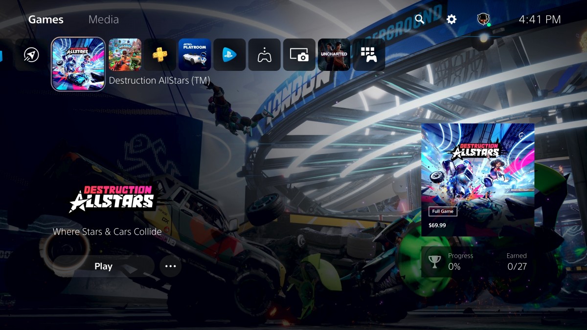
I don't like that UI one bit. It looks confusing as hell at first glance. No doubt, when you've fiddled about and explored it will become second nature.
All those hard to get ps4 themes invalidated?
I don't like that UI one bit. It looks confusing as hell at first glance. No doubt, when you've fiddled about and explored it will become second nature.
https://www.eurogamer.net/articles/...aming-headset-for-pc-xbox-one-ps4-switch-7032I’ve got the sony wireless 3D Audio headphones ordered. However I also have a series X on order. Does anyone know of a set of wireless headphones that will work on both. Tempted to cancel the Sony ones and get a set that will work on both
Looks awesomeDF take on the UI presentation. Exciting times https://www.eurogamer.net/articles/digitalfoundry-2020-a-first-look-at-the-ps5-user-interface
Am I missing something? Why does it feel like Xbox...
If I want to play on PS4 and ps5 then I have to buy the PS4 version right? Then download the ps5 one which would be free to do???Miles morales is £44.99 @ Currys just now with a code (FNDDGAME) if it helps anyone.
Thanks ! PurchasedMiles morales is £44.99 @ Currys just now with a code (FNDDGAME) if it helps anyone.

If I want to play on PS4 and ps5 then I have to buy the PS4 version right? Then download the ps5 one which would be free to do???
Not overly bothered with the new UI. It works really fast but most of what they showed (Activities, PiP, Game Help) are a bit too gimicky and like the initial XOne dash in 2013.
Game icons need to be bigger as well.
I like that the UI is native 4K and native HDR out of the box - it's going to look glorious. Screenshots and video captures also 4K.
Why bigger? Seem fine to me.
That screen just looks plain awful. I like the little game bar across the top.
But then you just get some icon and text floating in the middle of nowhere and a "play" button. And what's going on with the right hand side. An advert/link to the store for a game you already own?
