

I am currently doing a module on an introduction to web design in uni and we have to code a website using HTML all in notepad.
Is there anyway to scale an image to the page no matter what size screen/resolution is set?
I have the fish with line image in the outer div, which is the grey box with this code.
This results in what I want
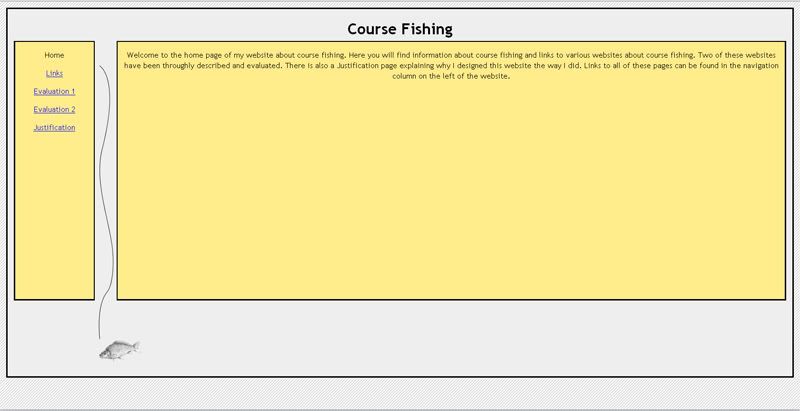
However if I reduce the size of the browser the image does not appear in the correct position.
I am controlling the style with a CSS file. So is there a way to make the fish iimage to display between the two yellow boxes no matter what the screen size is?
Thanks
Is there anyway to scale an image to the page no matter what size screen/resolution is set?
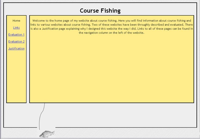
I have the fish with line image in the outer div, which is the grey box with this code.
Code:
<body>
 <div id="outer">
 <h1>Course Fishing</h1>
<img src="linefish.jpg" alt="Fish and Line for the background" align="left" hspace="180">
This results in what I want
However if I reduce the size of the browser the image does not appear in the correct position.
I am controlling the style with a CSS file. So is there a way to make the fish iimage to display between the two yellow boxes no matter what the screen size is?
Thanks
")


")
