c&c on a few images if anyone is about? :)

GeX

GeX

Soldato
Joined
17 Dec 2002
Posts
7,013
Location
Manchester
i don't normally like posting threads like this (cos i get ripped.. but still, let me know what you think of these - i'm still new to this and eager to learn).

1>
DSCF3058.JPG


2>
DSCF3100.JPG


3>
DSCF3174.JPG


4>
Picture%20245.jpg


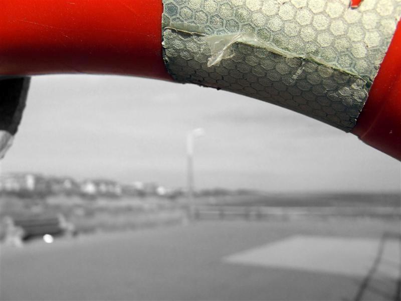
1> my first play in photoshop at selective colouring, and playing with the camera at locking autofocus and recomposing the shot.

2> looked better focused on the bars like that than on the background i thought.

3> long exposure, overexposed? I have a few less exposed like that one.

4> i just like this photo.
 
i think image 3 is the best of the bunch although i would personally straighten it slightly and crop out the path in the bottom right hand corner mate.
 
1. Huh.. what is it? Doesn't work whatever it is im afraid.
2. I see what you were trying to do, but doesn't work imo. Slightly wonky as well.
3. This is by far the best of the lot. Quite a nice texture on the water and good lighting(white light is slightly burnt out in a couple of places, but not badly) Could do with straightening though.
4. Afain a nice picture. Would be more effective if you used a square crop, and had the centre hole in the middle of the frame.

:)
 
I agree with Kahn and these crops are much better. The light at the top right of the third image was offputting to me and now my eye is drawn to the building and water :) Good pictures.
 
I think the #4 would look better if you could get the centre in the top right or top left with some space around it, rather than smack bang in the middle as suggested.
 
antc said:
i think image 3 is the best of the bunch although i would personally straighten it slightly and crop out the path in the bottom right hand corner mate.
i like the path it gives it depth
 
I quite like your idea in 1, wonder what it would have looked like if you had used the whole of the life ring (thats what it is right??) as a frame instead of the top bit?

I'm not sure about 2, I don't know where to start looking.

3 is great, to me the over exposed pieces don't really affect the picture. I don't like the street lamps on the right though. Perhaps crop them or remove them?

4, as has been said, the top of the 'thing' is too central, it needs to be framed so that it sits on one of the top thirds.
 
thanks everyone :)

Sol said:
I think the #4 would look better if you could get the centre in the top right or top left with some space around it, rather than smack bang in the middle as suggested.

if the weather is nice tomorrow, i'll reshoot that with different composistion. But i'm not so sure it'd work too far off centre. It's a decayed spiral tower that i'm shooting, and i love the way it closes in toward the top / centre and not sure how well it'd work offset.

Ross1234 said:
i like the path it gives it depth

thanks, that's what i was aiming for when i shot it. Wasn't sure if it had worked or not though. If anyone wants to have a flick through the other shots from that outing, they're here:

http://tackycheese.net/gallery/main.php?g2_itemId=8418

AndyBorzi said:
I quite like your idea in 1, wonder what it would have looked like if you had used the whole of the life ring (thats what it is right??) as a frame instead of the top bit?

3 is great, to me the over exposed pieces don't really affect the picture. I don't like the street lamps on the right though. Perhaps crop them or remove them?

4, as has been said, the top of the 'thing' is too central, it needs to be framed so that it sits on one of the top thirds.

1> it is a life ring, it sits on a metal pole though. As you can see in this shot http://tackycheese.net/images/ab_ocuk/cc_1/low_light_lake/DSCF3042.JPG So i couldn't really use the whole thing as a frame.

3> I'm not skilled enough to remove them and not keen on cropping it much further as i'd lose the edge of the water.

4> Will reshoot and see.

Justin said:
Hmm, I like number one, I think it's very creative.

thank-you. I did quite like that one myself. Not everyone does though :)
 
Back
Top Bottom