C&C Required

Soldato
Joined
16 Nov 2010
Posts
16,513
Location
Swimming in a lake
Ok, need some constructive criticism really!

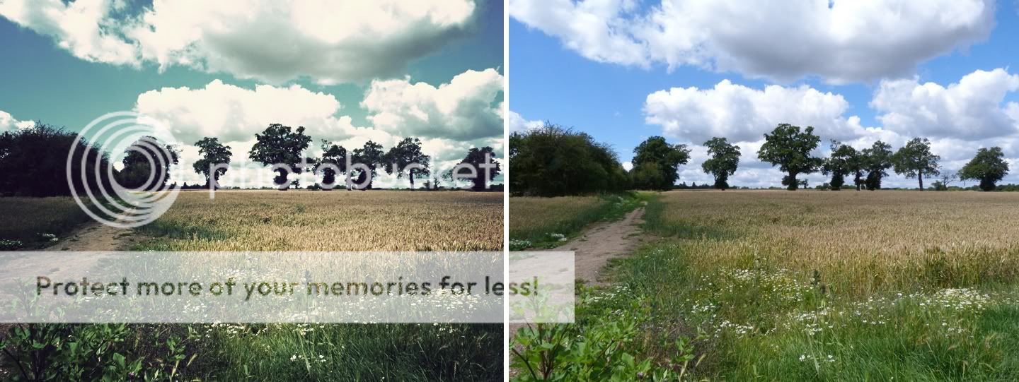
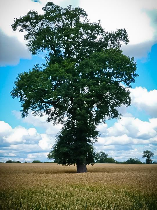
Recently bought a Lumix FZ45, for a holiday, and ended up taking plenty of photos. This got me back into a passion for photography, however this time I've actually looked more into the basic stuff such as Aperture and Shutter speed, and all of that, so I now understand the basics.

Anyway, went out around the village today to have a look around and grab some photos. The below are the best of the bunch, and to be honest, I'm not particularly happy with even them! Whilst I don't think there's anything particularly wrong with them, they simply have no Wow factor....

Really I'm just looking for advice on what might be wrong, what I could do to improve etc... I think lighting and composition are the biggest issues... possibly, but feel free to disagree! :)

p1010201e.jpg

p1010206l.jpg

p1010213p.jpg

p1010216u.jpg

p1010219gm.jpg

p1010223h.jpg

p1010224wd.jpg

p1010231w.jpg


kd
 
I find Lightroom best for adjusting images, Photoshop is great don't get me wrong, but Lightroom just has everything at hand and I find myself using CS5 for fixing blemishes in portraits and nothing more.

Perfect example of a bit of post processing in Lightroom:
before_after_1.jpg
 
Pic1-
A wider aperture (smaller f stop) would make background more out of focus.
Subject is a little out of focus.

pic2-
Because of the bright sky behind the tree, it has fooled the camera meter to expose partially for the sky & under-expose the rest a little.
Unless you want the subject underexposed and make the sky look better.
When shooting against a bright background you could take a meter reading from eg. the ground & lock the setting to this in manual or maybe apply a 2 stop over-exposure compensation.
Composition: the tree is very dominant, theres another similar tree to the right of the frame so maybe some arty composition could have been interesting.

Pic3-
Again the subject is underexposed due to the bright sky.
Unless you want the subject underexposed and make the sky look better.
Composition: the white line on the road is not enough to hold the bottom of the pic in balance, maybe have 2 white lines or not include the road.

pic4-
Maybe half a stop overexposed.
Have to watch out for vertical lines when shooting close with a wide angle, which can be partially corrected in cs5.
Composition: one of the black bumpers missing is annoying.

pic5-
Good exposure.
Composition: has good impact, maybe the rest of the vehicle had some good views too?

pic6-
Overexposed a stop or 2, probably because the side of the train was in shadow.
Composition: I would like to see more of the front of the train & multiple focal points vying for attention is distracting.

pic7-
Maybe half a stop overexposed, nice to get some blue sky too, probably because the building was brightly lit.
Composition: maybe better without the car?

pic8-
Bright sky has underexposed the foreground a stop.
Composition: The horizon line is cutting the image in half.
May have been possible use the path to lead the eye into the scene a bit more?

Overall:
Some nice shots :)
A polarizer filter can help make a sky more blue & still expose the foreground/subject well.
Maybe B&W for some subjects like the train or station.
Id wiki ‘the rule of thirds’.

I hope Ive been a help.
 
You're spot on with composition needing some work IMO, I'm no expert by any means but here's my comments on your pictures;

1 - The subject matter isn't all that interesting, background is a bit cluttered which draws attention away from the subject.

2 - It's a tree, in the middle of the picture. It's not a particularly interesting tree nor is the lighting. eg, if the sun was behind the tree and the light was breaking through the branches that would be interesting visually. As it is, it's just a tree.

3 - Again, it's just a house, smack bang in the middle of the shot. The road doesn't add anything, the dark cloud above detracts attention away from the subject matter and the leaves popping in on the left could be cloned out to improve. The exposure looks right for the sky but the building looking a bit underexposed.

4 - You've chopped the front right hand side of the train off, bus in the background is distracting and the sky is clipped.

5 - Something not quite right witht his one, not sure if it's too low an angle. Might be that the bus isn't symmetrical?

6 - Half a hut, cluttered area, cut the left edge of the train off. Too many things distracting away from the subject IMO.

7 - It's a building (pub?) with a car in front & you've chopped the right edge of the building off. The car adds nothing. The sky is nice though :)

8 - Sky looks good, plant at the bottom left corner is distracting. Edited version looks much better.

Hope you don't think I've been harsh, just given the C&C asked for as my eyes see it. Keep taking pictures, think about whether what you're looking at through the viewfinder is interesting or not. Sometimes a step or two to either side can change a shot completely. Keep practicing :)

EDIT - Number 2 with a bit of a tweak in Lightroom;

p1010206l.jpg
 
Last edited:
Nice edit of the tree in Lightroom there.
I really like the colour of the Maze or whatever crop it is.
Still just a tree, but has a lot more 'wow' now :)
The RAW would have more detail available too, so it just shows how much more you can do to a photograph.
Obviously getting it right the first time would be better, although with exposure conflicts etc. this can be difficult.
At least with digital, gone are the days of cross-curve colour faults (as far as I know) & each film having its own 'personality'.
 
Back
Top Bottom