Associate
- Joined
- 25 Nov 2006
- Posts
- 377

Please remember that any mention of competitors, hinting at competitors or offering to provide details of competitors will result in an account suspension. The full rules can be found under the 'Terms and Rules' link in the bottom right corner of your screen. Just don't mention competitors in any way, shape or form and you'll be OK.
so guys i finally got this vector graphics thing down what do you think?
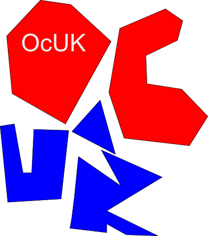
i fink its good cause it shows ocuk wants to help the uk by supporting its olimpings and is also striking

This really worries me
The recession is bitting so hard OCuk cant afford to get a new professional logo
Hope things pick up for you guys
")
")
My entry!


Another good'n, bit more colour?
Just a suggestion then we can take turns to use the 285


Hey sure thing
Re colour; it's tricky without more details on the project... the more colours/effects involved means more cost to produce in different mediums. We've also got to be aware that the logo is going to be applied to clothing... if it's printed on then it's less of a problem, but if it's embroidered then the logo needs to be simpler.
I think this logo would work fine in two colours, if it was printed on a field of the third colour. IE, blue shirts with the white text and red needle. Or any combination of that sort... It would also hold up well printed in black and white / one solid colour (fax etc) which all logos should do!