Does this work in b&w?

Associate
Joined
21 Feb 2003
Posts
1,348
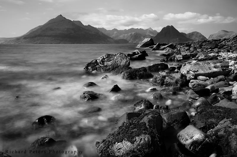
I've had a go at converting one of my favourite images from Skye in to black and white. The colour version bugs me slightly because of the sky so I thought I'd try mono, also pushed on by the conversation I had recently about selling black and white images.

I'm not used to converting landscapes to black and white, it seems much harder than pictures of people!! lol

Anyway, here is a first attempt, does the image lend itself to black & white and does it need tweaking? I'm not sure if the rocks are just too busy for a mono conversion?!

_DSC3477_bandw.jpg


Also, did another poster mock up to see what it would look like as a finished result on a wall:
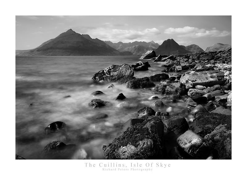
_DSC3477_bandw_poster.jpg


What do we think :confused:

EDIT: I re-uploaded to correct a spelling mistake but gave it the same file name but its not showing the corrected image.
 
Last edited:
It looks good no doubt about that but my eye keeps getting pulled to the rocks so what you said about them being too busy may be true.
 
whilst the rocks section is busy, personally I don't see that it detracts aesthetically. I really like the conversion, and the rocks are the focal point of the image after all :D
 
EDIT: I re-uploaded to correct a spelling mistake but gave it the same file name but its not showing the corrected image.
Pressing F5 will probably sort it out.

whilst the rocks section is busy, personally I don't see that it detracts aesthetically. I really like the conversion, and the rocks are the focal point of the image after all :D
Ditto. I like the conversion.
 
Works well I think, but it's not quite balanced with those rocks down there. I think the sky and skyline need a bit of local contrast applied. Perhaps some subtle HDR to bring the sky out to balance the rocks out?
 
Thanks all.

Trouble with the sky is there isn't much to play with in the original as it was very hazy, so bringing it out too much is going to make it look over processed I think. I might have a bit more of a play though and see what I can do. One thing I will say, the rocks do look better at full res...web size is a ll a bit cramped!
 
your eyes are been pulled to the rocks because of the seperation in contrast which I think you may of made more apparent by burning the rocks?

I personally think its works nicely as a black n white shot but you have also posted this as a color shot so I am always looking at that. Others wont of seen color though so its a new image to those.

Johnny
 
I dont believe it works, the image appears split you have the on the right a very stong image with good stong blacks and highlights this half works well but on the left it is to flat and this spreads across the whole background. Its hard to describe but the vast difference between the rocks and the remainder of the frame are over powering and i doubt there is enough colour in the original to balance this out, The flow from the rocks to the water works well its mainly the back drop that is distracting.
 
Back
Top Bottom