

Does anyone know if it's possible to draw a chart like this in Excel?
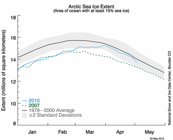
What I mean is the grey +/- error band. Each point has a different +/- 2 SD error. I can plot the data with the error bars associated with each point - what I can't work out how to do is draw a grey band like they have here.
What I mean is the grey +/- error band. Each point has a different +/- 2 SD error. I can plot the data with the error bars associated with each point - what I can't work out how to do is draw a grey band like they have here.