

You are using an out of date browser. It may not display this or other websites correctly.
You should upgrade or use an alternative browser.
You should upgrade or use an alternative browser.
F1 2021 Car Launches
- Thread starter Junglist
- Start date
More options
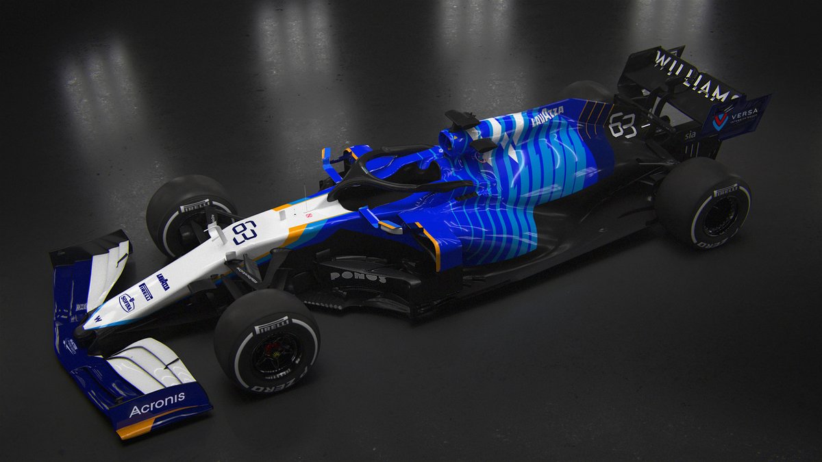
Thread starter's postsNew Williams livery looks decidedly Kimi-e...ra Sauber
That came to my mind too. Not overly impressed with the new livery. It's meant to be inspired by the cars of the 80's and 90's. Ummm. Ok

Yeah that's it, dated.That came to my mind too. Not overly impressed with the new livery. It's meant to be inspired by the cars of the 80's and 90's. Ummm. Ok
That came to my mind too. Not overly impressed with the new livery. It's meant to be inspired by the cars of the 80's and 90's. Ummm. Ok
Those cars being Simteks, Pacifics and other such tailend charlies?
Those too.Those cars being Simteks, Pacifics and other such tailend charlies?
But no. Its meant to be inspired by the dominant Williams cars of the 80s and 90s.
I just can't see it.
Those too.
But no. Its meant to be inspired by the dominant Williams cars of the 80s and 90s.
I just can't see it.
Williams FW15C:
*blinks*
Nah, don't see it. With the light coloured front and blue engine cover it's definitely more Minardi M01 than all-conquering early '90s Williams...
Williams
Oh dear lord. This is the worst livery I've seen in some years
The alpine livery has grown on me.
Still massively disappointed by the number of white/red/blue cars
Generally the liveries are worse than last year.
Alpine.. Good but less distinctive
Merc.. OK, but worse. Too much red
Aston.. Good, not a fan of the green. Better than pink. A rare better than last year, distinctive. Probably my fav. If it was racing green. Definitely the best
Haas.. Not too bad on its own.. If it was a Russian team. Can't believe an American team went with a Russian flag!
Red bull.. Boring. Never liked it either. Dark purple/blue with red and yellow text and logos? Pass!
Mclaren.. Drop the blue! Doesn't go. Or at least reduce it. Orange and black would have looked ace. Its OK I guess
Alpha.. Good in its own. Don't think it works well in f1. On a black track.
Alfa.. Mediocre .. But another red and white. It'll be like their performance. Just fade into the background.
Williams.. Where's the sick bucket. Might be worse than the Renault ING orange, white, blue, yellow mess
Just can't stand the white/red/blue cars so many of them. White is actually my least favourite f1 colour.
Deleted member 651465
Deleted member 651465
I like the Williams. It’s different and isn’t one solid colour which I’ve always found boring.
Is it winning design awards; no... but at least it’s not the same boring design (Red Bull) etc.
Is it winning design awards; no... but at least it’s not the same boring design (Red Bull) etc.
Soldato
- Joined
- 17 Oct 2005
- Posts
- 6,243
- Location
- North of Watford Gap
Am I the only one who thinks the McLaren livery looks good? On track especially I think the blue works (less so in the studio shots) but I suppose it might look even better with a slightly deeper blue.
I think back to the Orange Arrows of 2000-2002 and they largely looked good too. Only thing that spoiled it was too many sponsors and Red Bull's larger logos in 2002.
I think back to the Orange Arrows of 2000-2002 and they largely looked good too. Only thing that spoiled it was too many sponsors and Red Bull's larger logos in 2002.
I like it, but it’s very safe. Quite traditional.Am I the only one who thinks the McLaren livery looks good? On track especially I think the blue works (less so in the studio shots) but I suppose it might look even better with a slightly deeper blue.
I think back to the Orange Arrows of 2000-2002 and they largely looked good too. Only thing that spoiled it was too many sponsors and Red Bull's larger logos in 2002.
You’re not alone in liking the McLaren, it’s up there with Aston Martin as the best this year.
Merc would be too as changing to a black car was great and the best last year but I’m not so keen on the changes for this year; especially the AMG logos over the rear looks considerably worse than tri-star pattern.
Merc would be too as changing to a black car was great and the best last year but I’m not so keen on the changes for this year; especially the AMG logos over the rear looks considerably worse than tri-star pattern.
Man of Honour
- Joined
- 21 Nov 2004
- Posts
- 46,633
The green on the Ferrari  - it looks terrible! They need to ditch that sponsor.
- it looks terrible! They need to ditch that sponsor.Associate
- Joined
- 13 Sep 2003
- Posts
- 1,642
- Location
- Oxford, UK
Last edited:
That's not a bad Ferrari livery at all.
The red's fine. The green logo sucks.
Soldato
- Joined
- 17 Oct 2005
- Posts
- 6,243
- Location
- North of Watford Gap
Livery wise that looks absolutely hideous in my opinion. There's no cohesion or consistency anywhere.
Still, with a few simple changes it could have gone from what I think is the worst livery to one of the best:
Still, with a few simple changes it could have gone from what I think is the worst livery to one of the best:
Not sure what the issue is with some of the image hosting on here, not seeing any that @Kevin Clark has posted recently.
Edit: Hotlinking from Twitter?
The Ferrari (lookup up online) IMO is the worst they've had for quite some time. I assume the green is to bring the Italian colours together.
Edit: Hotlinking from Twitter?
The Ferrari (lookup up online) IMO is the worst they've had for quite some time. I assume the green is to bring the Italian colours together.
Last edited: