First HDR C&C if you will?

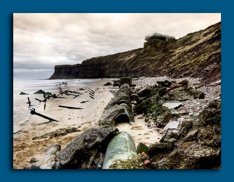
Thanks, heres what i meant. Im still kinda thinking this is a bit overprocessed.
Christmas2008249copy.jpg

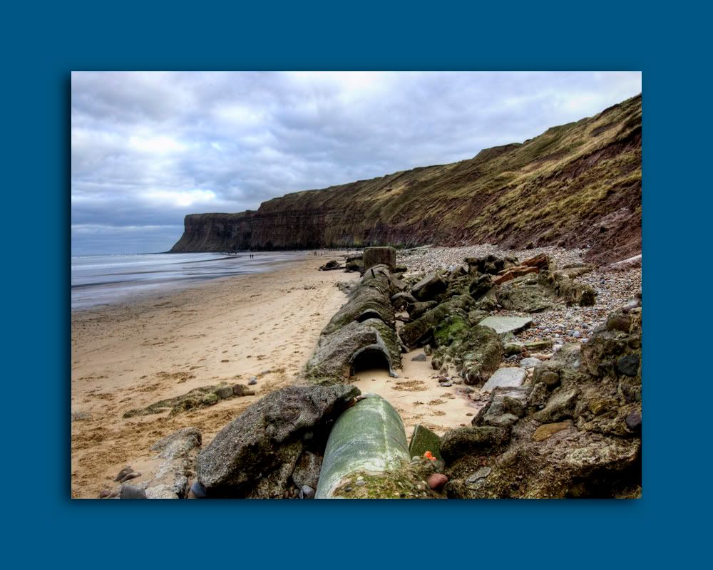
You see that looks quite nice, because it's not overdone, this is what HDR should be like.
 
The OP pic reminds me of the guy in motors who always completely overdid HDR on all his car photos. It's a shame because it spoils a lot of good photos.
 
It wasn't a dig at you mate, I commend you for trying, and it's good to try new things. I think some people on here just take photography a bit too seriously :)

I didnt take it as one :) I gotta start somewhere right?
Im certain some people will have a lot more time for it than others, and the pro's or those who make a living from Photography are sure to have strong views when us newbs post garbage. I enjoy taking pics, and if i get a few good ones from time to time even better! Its good to have wise folk around to point you in the right direction too :)

Don't take what I say to mean anything regarding photography, I'm very much a "noob".
 
Maybe we should have a weekly thread...

Post a poor photo original and let everyone have a go at processing how they would.. :D

That last one looks really nice.
thumb.gif
 
I haven't posted in here cos I thought everything had been said, but I'm bored...

Regardless of HDR I think sometiems it's good sometimes not. In this instance all it seems to have done is muddy the picture, bring out what looks like a luminous apple core in the foreground and the sky. But looking at the orginal snaps, the Sky basically looks like the sky in the second pic. I could have mixed the 2 exposures but it was a quick edit...

The original picture to me is... Far too dark (it reminds me of Quake 1 - all shades of brown :) )

There to me seemed to be no focal point. I found my eyes wondering looking at the image.

The central pipe is too central. Too the right of the pipe is..uh. pretty uninteresting. I orginally just cropped all that out and kept the beach, but decided it looked better as a wide aspect. Perhaps could have left more of the beach.

Corrected the horizon. Is there a slight curvature on the horizon? Barrel distortion?

Brightened the image.. I thought the greens, and is it some sunlight shining through for the yellow patches? to be quite nice.

I didn't even realise there were people on the beach, now that I see them it's better.

Burned a little bit of the sky (badly) to remove the over exposed white parts.

Could be improved further IMO by : layign the horizon on the bottom third, rather than the quarter (more beach)
Making the sky more blue, perhaps by using the second exposure.

Warmed + increased satuaration. I like a warm saturated image.
 
Back
Top Bottom