I'm still learning how to use Photoshop/Gimp and the likes, so treat me like a newbie.
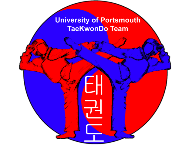
I've made a logo for my uni club with photoshop/GIMP - I switched between because I'm using MacOSX and parallel Windows XP, which incidently can't recognise Korean until I used Gimp in OSX. Anyway...
even with my newbie eyes, I can see the logo is very rough around the edges - this will be used for T-Shirt printings (~6"x9") on the back and on websites. You think this is good enough or is there ways of making it better?
Appreciate all help.
P/S Here's the .psd of the file if needed:
http://www.yourfilehost.com/media.php?cat=other&file=UoP_TKD_Logo.psd
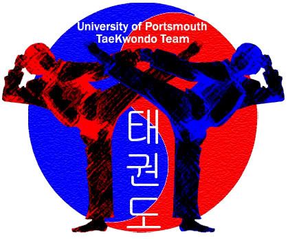

")