I can't say I was offended but as far as how to PP, unless you're trying to re-produce perfect colours and shades for some kind of product photography or something, I don't really see any advantage in processing to certain fixed standards.
Photos are meant to look good so if they do so despite having Lightroom sliderbars in all the wrong places then who cares?

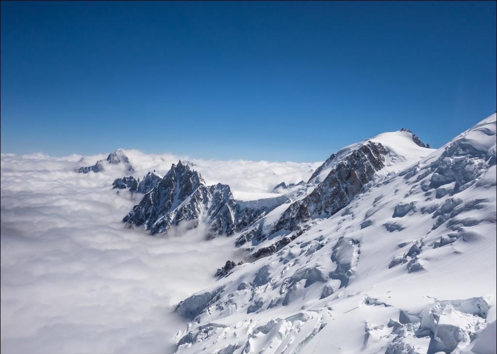
This photo was fairly normally exposed etc but when I moved a few bars around I found it looked quite funky as more of a silhouette so I processed that way instead. Might not be to everyone's taste but I don't take pics for them lol
Fair enough, but what I think your misunderstanding! That looks better the way you did it, however an image of white snow and dark mountains are a different thing. Your image above has no white!! If you make white snow, blue, which it's not then it, welllllll its wrong.
If you want to set out to create something that isn't 100% realistic for artistic effect then fine, but if your trying to achieve a perfect realistic representation of the world, then it's a different matter entirely.
Lol?
Photography is an art not a science. Surely it's down to everyone's personal preferences whether or not they have colour balanced or contrast controlled'correctly'. I'll assume you didn't mean to come across quite so arrogant. IMO (not that it matters at all) your version looks a little too worked on but then my taste on that particular image preferred a more natural, out of the camera look. Does that mean you've done something incorrectly?
Throw out the rule book
")
That's fair, like I said in my post, some see it as a matter of opinion, but no paid professional would. What you take a shot (photography) of is an art, processing is the art of science an math.
Back in the day, it would have been an art form, pushing and pulling, getting things looking right, however digital work has removed that in a sense.
I didn't see anyone say " Ive processed this so that the shadows and highlights are a shade of blue and the blacks are slightly grey because I think it looks better for artistic effect".
I won't be throwing out any rule book any time soon, otherwise I wouldn't be getting paid either.
Whoever taught you has severely hampered your creativity, post processing isn't some objective fact where blacks have to blacks and contrast needs to be maximised. For example your version has blues /way/ oversaturated, the snow is slightly yellow and what the hell is that shadow. I understand you may well have your own opinion on post processing, but you're presenting it like gospel truth when it's a subjective, being frankly quite rude about it and that I take issue with.
You need to get your monitor calibrated, if your seeing any yellow in that, somethings wrong. Check the values!
There is absolutely no question about it, it's not even my opinion, it's just how a camera works, if your not going to listen to facts then you will never learn.
I remember now I why I choose to avoid this forum, was a mistake for me to come back. Excuse my intrusion it won't happen again.


") . I'm just a sucker for mono and felt it was a stronger image converted.
. I'm just a sucker for mono and felt it was a stronger image converted.