how do you deciede on borders?

  • Thread starter Thread starter GeX
  • Start date Start date

GeX

GeX

Soldato
Joined
17 Dec 2002
Posts
6,982
Location
Manchester
i feel my skills have progressed nicely, and now i want to look into displaying images. i've seen many images where borders have added to the effect of the image. i've had a play around, and mine don't. just wondering how you guys deciede on what kind of borders to put on photos.

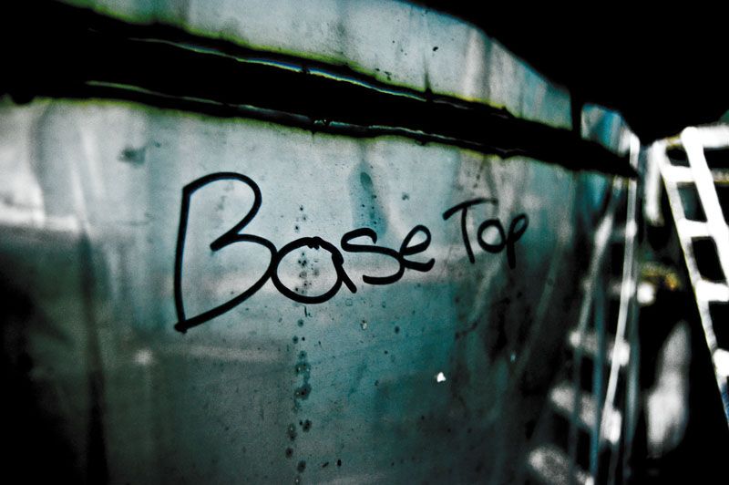
how would you frame these two?

base_top.jpg


chalk.jpg


as a side thing, any CC on them two images?
 
I like both the pictures, but I think you might want to remove the second one because of the swear.

Think the first one is my fav because of the nice effect the light has on the grimy window.
 
i wouldn't have said it's a swear.. but if the mods feel it is, i'll remove it np.

thanks for the feedback :)
 
Wicked pictures. May I ask how you got such a dark grungy type feel to them?

As for the borders, I usually have a small white border (4 pixels) and then a black border about 40 pixels. If that doesn't look right, I try just a white border, if that doesn't look right, I don't bother with a border.
 
i either use a simple black or white border pending on the image, very thin around the edge, or if sometimes do a clear border so it doesn't cut as much of the image.
As for the sweary most people in the photo section will just see it as good example of photography, but its a family forum so may not be accepted
 
thanks guys, i will have a mess around and see what borders like that look like on them

Wicked pictures. May I ask how you got such a dark grungy type feel to them?

most of the work was done in lightroom, in short - i increased the blacks, and then upped the expsoure to compensate for lost detail. then tweaked other levels to get it to look 'right'. vibrance to zero, upped the saturation slightly. clairty quite high, which picks out detail in the reflected part quite nicely.

this is how it started

DSC_1518_org.jpg


TheKnat said:
because of the nice effect the light has on the grimy window

hehe, now you can see it isn't a window :)
 
That is really cool. Really did think it was a window on the first pic.

Hopefully when I get taking some decent pics I can learn to process them this well
 
You cant go wrong with a thin white border. Anything more and you risk taking the eye away from the shot itself. Keep it simple, stupid!
 
Back
Top Bottom