How would you improve this shot?

Associate
Joined
9 Jul 2008
Posts
117
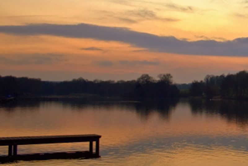
I took this shot a few weeks ago, I do like it but i feel theres somthing missing.
IMG_3490-2.jpg


I walk round this lake 2 or 3 times a week with the dog and am looking forward to when the trees blossom to get some good shots. All the shots Ive taken so far seem to have somthing missing so some comments and criticisms would be nice.

IMG_3489.jpg


Thanks
 
Last edited:
I think it looks great :)

Not sure really how you can improve it, maybe as you say in Spring/Summer time then things will look brighter and less empty
 
I know some people wont like this response, but the easiest way to improve the first shot is to get rid of the awful border. A simple an effective way to make a photo look more professional - leave the borders for printing and framing. Similarly with your name, its just lain distracting.

Secondly, try to gain more symmetry in the foreground of the first photo.
 
The colours are wonderful, but I think your composition is a little out. I think you should have got closer thus removing all off the black in the foreground. I would have got closer to the wooden jetty thats sticking out and made more of that in the shot as it makes a nice silhoette.

As for the B&W (sorry); but those trails in the sky look terrible. I also think, the thing that sells the scene is the colours in the sky; without them you are left with a dull photo. Concentrate on the colour one, forget about the B&W.

:)
 
The colours are wonderful, but I think your composition is a little out. I think you should have got closer thus removing all off the black in the foreground. I would have got closer to the wooden jetty thats sticking out and made more of that in the shot as it makes a nice silhouette.

As for the B&W (sorry); but those trails in the sky look terrible. I also think, the thing that sells the scene is the colours in the sky; without them you are left with a dull photo. Concentrate on the colour one, forget about the B&W.

:)

This. :)

The composition is a little out which is what gives the 'there's something not quite right' feel to it.

I would have gotten lower and a lot closer to the jetty. Maybe have even shot straight down the jetty. (however the sun might have been on the wrong side..)

Either way, It's a nice picture so well done but the framing could have been a little better.

I hope it helps!
 
Last edited:
Think I agree with Martin and Blastman, it's the colours that make it but the composition need to be tighter, something like this works better (but try and take it from nearer the jetty to improve the angle etc):

IMG_3490-2.jpg
 
I quite like the original as it is, if I'm perfectly honest. Perfect imperfection if you will.

Lose that little white imperfection in the middle of the bottom bank though.
 
darken the shadows, and up the contrast. it has an odd hazy looking effect to me.
 
Thanks so far for C&C

The B&W shot was just to show what was in the shot better thats all.

The border and name was just a phase I was going trought at the time of the shot should have uploaded shot without, but I already had this shot on my webspace.

The plane trails I was hoping would add to the shot to fill a bit of empty sky but I see what your saying, and now you've pointed it out my eyes keep getting drawn to them.

No tripod with this shot but have got one now.

My main problem is I see what looks like a good shot but when I've taken it and get home its just disappointing or somthing missing. Im slowly reading thought understanding exposure and a few internet guides, but there's nothing better then getting different views from other people and photographers.

once again thanks.
 
Practice makes perfect as they say .... and its true. The more you get out the better you will get. I often find my photography goes into a lull if I am not shooting regularly. Composition also comes more naturally the more I get out.
 
In terms of the actual framing etc, others have covered what I would also suggest. With regards improving that shot, I would simply use a levels adjustment layer to darken the blacks and mids a little, this removes that slightly hazy look that the pic has, and strengthens the colours which personally I think makes a big difference.

Valve
 
firstly you shot them both at pretty wide apertures for landscape 3.5 and 4.5 respectively, which may well explain the slightly muddy hazy look to the trees and other distant objects. First step for me would be to get you camera on a tripod and step down to f8 or f11 this should give you a much shaper more detailed result. I'd also recompose lower down and futher forward to get the path out of the foreground it dows nothing for me.
 
Back
Top Bottom