Inconsistent and unfinished GUI

Soldato
Joined
15 Jun 2005
Posts
2,835
Location
Edinburgh
So we are a couple of weeks in and I have got used to most of Windows 10's foibles. However for me the GUI just feels inconsistent and unfinished.

Window Title Bar Colour - locked on white unless you use a reg hack, but then you get odd title text colours on inactive windows.

Settings Panel - completely different look to the rest of the OS, monochrome grey/black with bad spacing. And you still have to go into good old Control Panel for some settings. Surely one app with basic and advanced views?

Context Menus - A right-click with give you one of four different menu styles.

Default Program pop up - this is just plain ugly.

Dark Mode - some modern apps have a dark skin whilst other don't. The OS dark skin can be turned on with a reg hack but has lots of issues (which I guess is why it is hidden)

Glitches - there are numerous other little glitches like lack of space padding around icons and a thin one pixel blue border on Notepad

Some of the best elements are the ones carried over from Windows 8, like the advanced views on File Copy and Task Manager. It really feels like there are three different GUI designs all mixed up.
 
Last edited:
Its a work in progress!

Control Panel:This is a massive overhaul that will take a long time to perfect although I wouldn't blame them if they left the current modern control panel as it is for more basic settings, and then used the legacy control panel for advanced users - that would make sense.

Dark mode - there is a reason why this hasn't been put into the release and that is because they haven't finished it - reg hacks are pointless as you are forcing an unfinished area then complaining about it
Title bar - same idea - there is a reason why it requires a reg hack - because its not finished.

I do agree that some of the UI elements arent quite finished but I think currently it looks fantastic and it will only get better IMO, give it time, this is an absolutely massive change and they are focusing on computers/tablets/xbox/windows phone all at the same time for consistency.
 
Sigh, another whine thread. The other 100 threads or the main thread not good enough or just that your views are more important?

With a tiny bit of common sense, gamble has added some perspective.

If you don't like it, don't use it. If you like it and have something useful to add, then provide feedback to ms.
 
So we are a couple of weeks in and I have got used to most of Windows 10's foibles. However for me the GUI just feels inconsistent and unfinished.

Window Title Bar Colour - locked on white unless you use a reg hack, but then you get odd title text colours on inactive windows.

Settings Panel - completely different look to the rest of the OS, monochrome grey/black with bad spacing. And you still have to go into good old Control Panel for some settings. Surely one app with basic and advanced views?

Context Menus - A right-click with give you one of four different menu styles.

Default Program pop up - this is just plain ugly.

Dark Mode - some modern apps have a dark skin whilst other don't. The OS dark skin can be turned on with a reg hack but has lots of issues (which I guess is why it is hidden)

Glitches - there are numerous other little glitches like lack of space padding around icons and a thin one pixel blue border on Notepad

Some of the best elements are the ones carried over from Windows 8, like the advanced views on File Copy and Task Manager. It really feels like there are three different GUI designs all mixed up.

UI wise it is a complete cluster****. Its as if all the UI elements from win95 onwards have been thrown into a bowl and a random number generator decides whats presented to the user.

reference right click menus, this older screenshot which is still valid highlights the issues.
EBORSjz.jpg

But we are meant to be apologetic as we should be thankful for our free operating system :rolleyes: that due to continual updates is basically alpha software.

encore
windows-10-file-explorer-2015.png

who designed this mess??? A seven year old with crayolas?

this is progress :rolleyes:

win8.1
Windows_8_1_This_PC_Explorer.png


win7
No_Libraries_in_Win_7_Explorer_Nav_.png


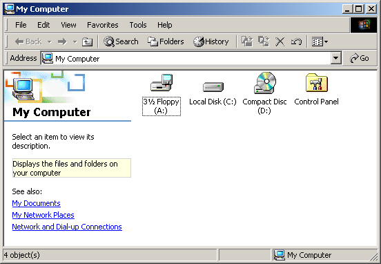
winxp
shared-folders-howto-1.jpg


win2k
win2000pro.png
 
Sigh, another whine thread. The other 100 threads or the main thread not good enough or just that your views are more important?

If you don't like it, don't use it. If you like it and have something useful to add, then provide feedback to ms.
I didn't see another thread specifically about the GUI. If you don't like my thread don't read it or comment in it.

I have used every version of Windows since v1.0 including ME! None have looked so much like a random collection of mismatched homebrew shareware. Unfortunately I have to use Windows 10 as I want DirectX 12.

I just don't buy the, it's a work in progress, they are concentrating on mobile devices argument. That may of been the case in Windows 8 but we are two releases on now. Isn't this meant to be the release to win back desktop users? Surely Microsoft has the resources to give us a great UX.

If you think this looks fantastic then either you must be very easily pleased or I have a very low tolerance for bad design.

51tv7r.jpg
 
Yup I'm constantly amazed how some people on here can't see the UI for what it is - as someone very aptly put it above its a complete cluster ****.

While I'm guessing its done for touchscreen reasons the amount of screen estate wasted for purely desktop use by the titlebars alone annoys me as well - from what I've seen there is no way to adjust it through the control panel you have to dive into the registry and tweak windows metrics by hand.

If you think this looks fantastic then either you must be very easily pleased or I have a very low tolerance for bad design.

Couldn't agree with you more. "mismatched homebrew shareware" is bang on.

Its a work in progress!

Control Panel:This is a massive overhaul that will take a long time to perfect although I wouldn't blame them if they left the current modern control panel as it is for more basic settings, and then used the legacy control panel for advanced users - that would make sense.

Dark mode - there is a reason why this hasn't been put into the release and that is because they haven't finished it - reg hacks are pointless as you are forcing an unfinished area then complaining about it
Title bar - same idea - there is a reason why it requires a reg hack - because its not finished.

I do agree that some of the UI elements arent quite finished but I think currently it looks fantastic and it will only get better IMO, give it time, this is an absolutely massive change and they are focusing on computers/tablets/xbox/windows phone all at the same time for consistency.

I can't really buy that - there is a general lack of direction with the shell layer with what direction there is changing every other major build (as can be seen from the history of the icons, menus, etc.) and the approach is just bad - ignoring many of the fundamental "dos and don'ts" of good UI design.
 
Last edited:
I can kind of see why they haven't included the ability to change titlebar colours, etc. without proper window transparency it looks awful - though no less awful than the rest of the UI really.

OGAh9z9.png


Only a complete clown would think that was an improvement or acceptable alternative to:

rKs8jLG.png
 
Last edited:
Back
Top Bottom