

Soldato
- Joined
- 7 Aug 2004
- Posts
- 11,302
Hey all ! long time no post in the photography section, its been a while but im getting back into it abit !, been doing some portrait shots recently, with some other random stuff, what you think ? critique and general comments welcome ")
#1

#2

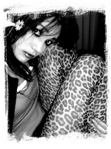
#3

#1
#2
#3


 your monitor setup properly ? using a calibrated dell 2407 here and they look just right to me, can easly see the detail, #2 I was looking for near no light around the edges to bring you into the photo, its that 'style' I was going for, thanks muchly for feed back
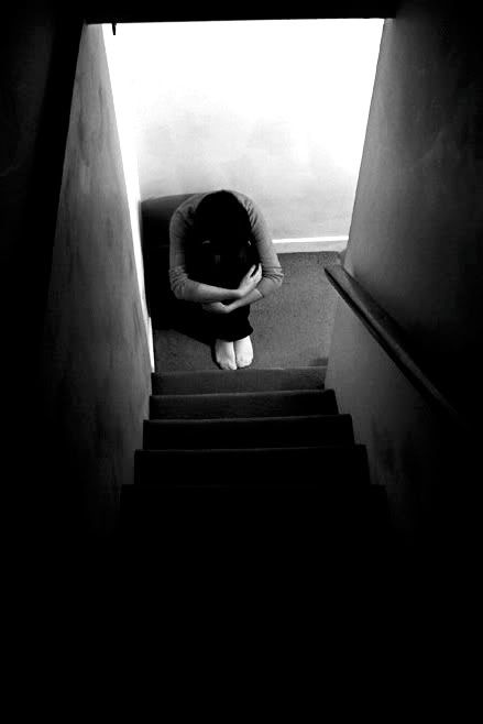
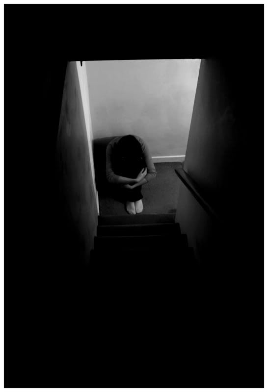
 yeah I just kinda like the 1st one as it is, may crop to just the guy, see how it works then. Glad people like #2