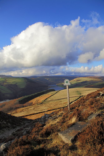
I don't like taco,potion of the photo in the OP. The sky and land are put of balance, there is a disproportionate amount of blu sky and the horizon line is slap bang in the middle which only work for certain shots (emphasizing symmetry and reflection for example).
Secondly I am not rally sure what the main subject is, In part because of the composition. The cloud seems as important as the landscape, and the only thing that really stands out is the sign post, which is crooked which feels uncomfortable.
It is hard to navigation the photo, there aren't any strong guiding lines or shapes that draws attention and guides the viewer.
I much prefer the landscape orientation photos. Stronger subject, much better composition, clearer details, more striking sky, better balance. The reservoir is a ice focal point and there are lots of leading lines. All the walls and even the trees guide the viewer to the lake. But I don't like the sign at all really and unfortunately the lake is underthings clouds with less interesting lighting.
This obviously sounds very negative. Please don't take it that way, I am giving critique as if I was critiquing my own work. I notice a fe of us have posted similar comments so it is probably something to think about.
In landscape work compositions can be very challenging. You need strong subject, good leading lines, paths or shapes that guide viewers from foreground to background, and details of interest. Most of the time you really have to choose between the sky or The landscape As a subject, it is very hard to have them both and a 50-50 split along a horizon rarely works (but there are exceptions).


")

