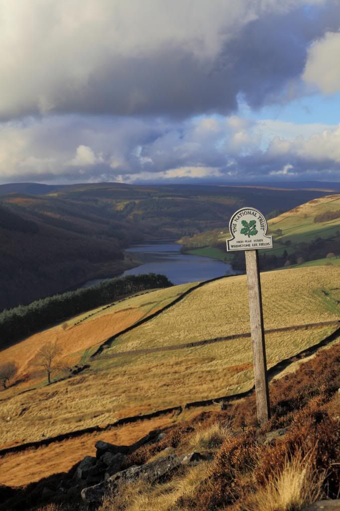
I love portrait orientations of landscapes, but the subject has to be right- some thing tall or long is good starting point. This scene could actually work as a portrait, but not with the sky at 50% for me.
Maybe it would be useful to explain to use why you like it, how you perceive the composition and how you imagine viewer's eyes navigate across the photo.
See now you've probably hit on my biggest problem as a photographer and that's that I don't think about things enough a lot of the time! I picked this photo because I've liked it from the minute I saw it on the LCD something about it just clicks with me which is a personal thing but your right when you deconstruct the composition there isn't really a lot holding it together.
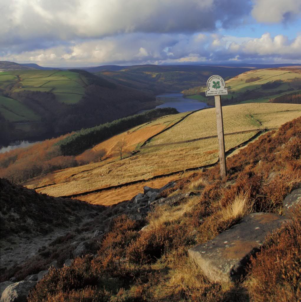
The landscape versions of the shot show there is a photo in there trying to get out but they are definitely more balanced and the lines leading the eye around the picture are much clearer.
Think I need to revisit this spot with my thinking cap on, which is probably the reminder I really need, anyone got a sticker on their camera saying slow down, think!
Having a look back through the shots I took this one now seems a better composition.

The balance of sky and foreground is better the sign is a bigger feature and there are two or three leading lines (hedges, walls and reservoir) leading the eye to the horizon.
Last edited:


