

Hi all
I want to make a website that ONLY works on mobile devices. But I don't know where to start. I thought that simple HTML might look ok but it seems zoomed out by default whereas BBC Mobile etc fills the screen nicely. Here is my code:
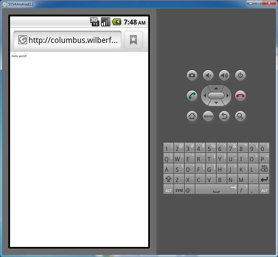
And this is what happens:
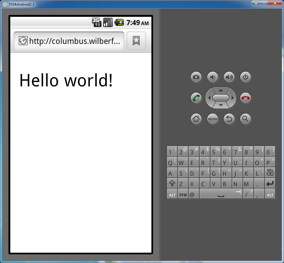
This is what I wanted to happen:
Where am I going wrong? Thanks in advance
I want to make a website that ONLY works on mobile devices. But I don't know where to start. I thought that simple HTML might look ok but it seems zoomed out by default whereas BBC Mobile etc fills the screen nicely. Here is my code:
Code:
<!DOCTYPE HTML PUBLIC "-//W3C//DTD HTML 4.01//EN"
   "http://www.w3.org/TR/html4/strict.dtd">
<HTML>
   <HEAD>
      <TITLE>My first HTML document</TITLE>
   </HEAD>
   <BODY>
      <P>Hello world!
   </BODY>
</HTML>
And this is what happens:
This is what I wanted to happen:
Where am I going wrong? Thanks in advance