Soldato
- Joined
- 10 Mar 2006
- Posts
- 3,975
Hi all, some of you may remember that I was asked to take some photos for the Museum of Power, kick-starting a little photography business for me.
Here's a tiny set of photos I took; have a look at them and destroy me as appropriate. I'll provide some background after some people have had a look at them, I'd like the honesty first.
Link to Flickr album here.
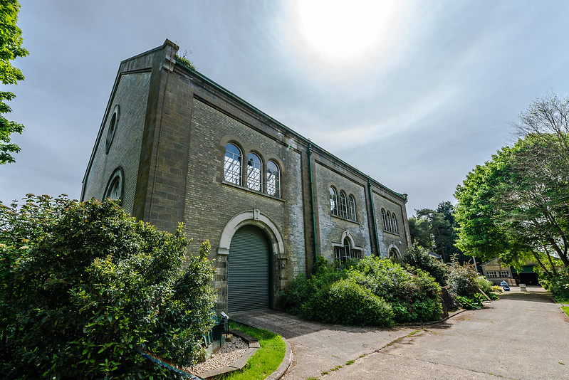 DSC_8121 by Alex Bayes, on Flickr
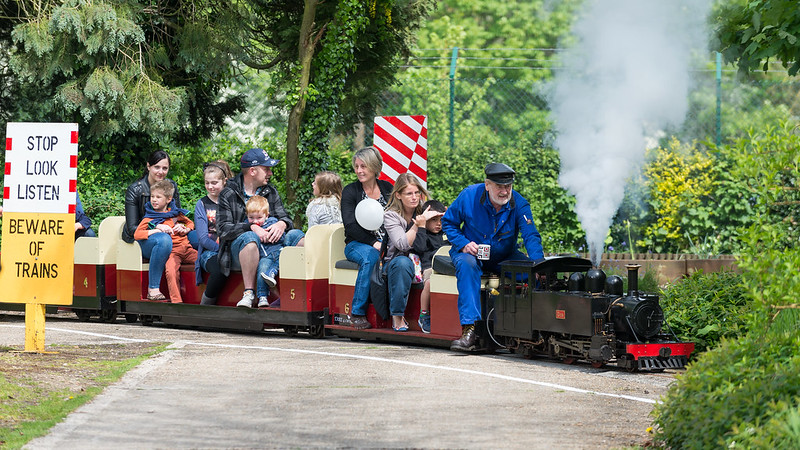 DSC_8044 by Alex Bayes, on Flickr
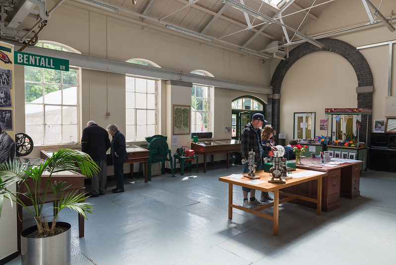 DSC_7982 by Alex Bayes, on Flickr
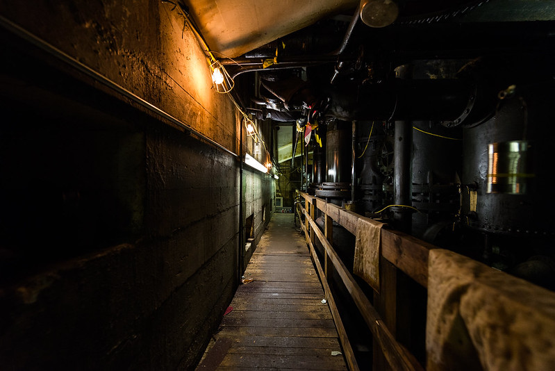 DSC_7950 by Alex Bayes, on Flickr
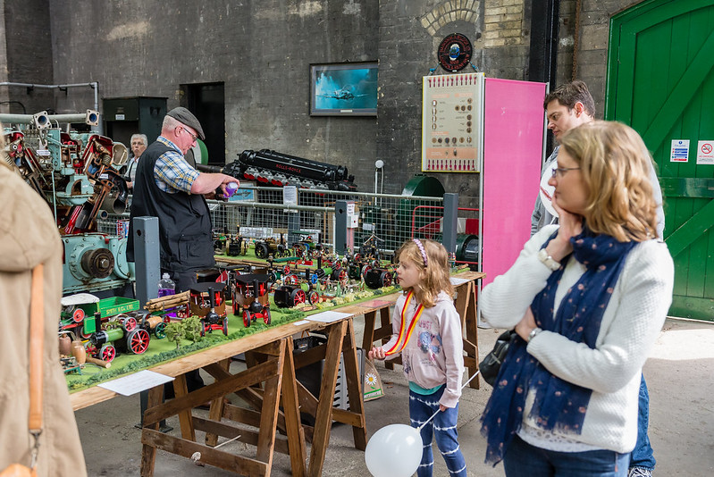 DSC_7919 by Alex Bayes, on Flickr
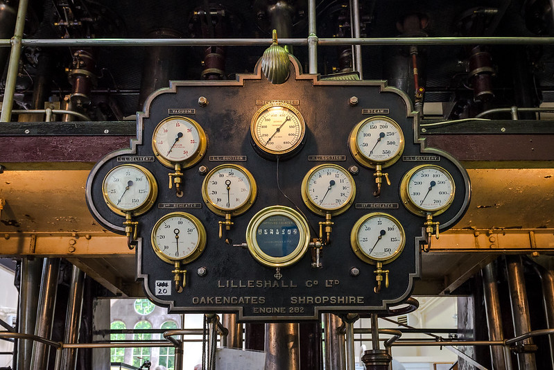 DSC_7915 by Alex Bayes, on Flickr
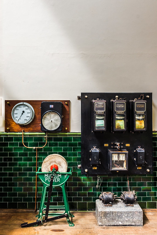 DSC_7909 by Alex Bayes, on Flickr
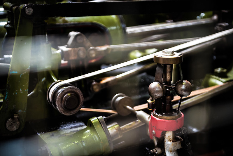 DSC_7908 by Alex Bayes, on Flickr
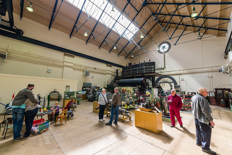 DSC_7888 by Alex Bayes, on Flickr
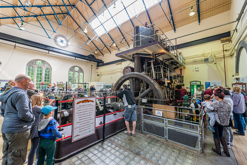 DSC_7852-2 by Alex Bayes, on Flickr
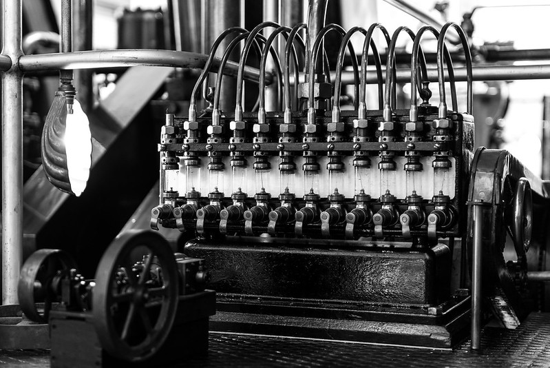 MoP by Alex Bayes, on Flickr
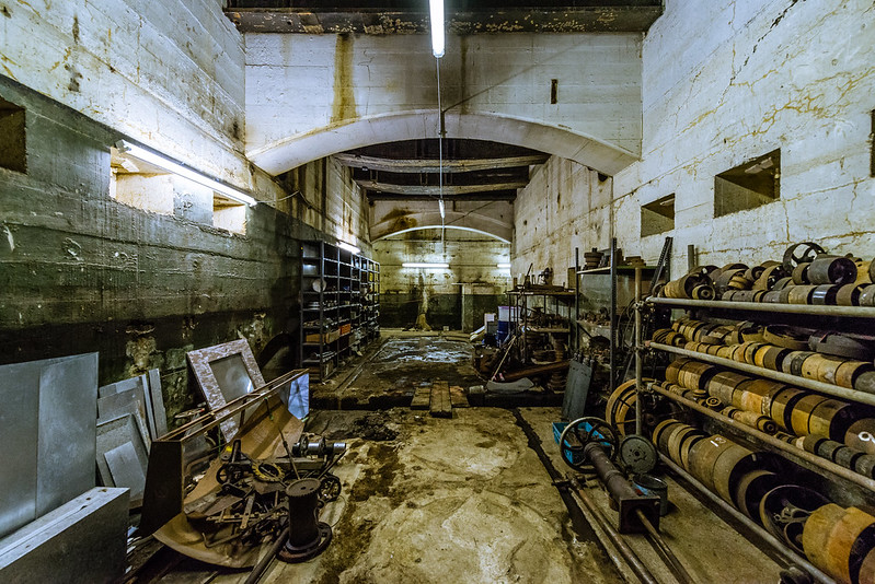 DSC_7959 by Alex Bayes, on Flickr
Here's a tiny set of photos I took; have a look at them and destroy me as appropriate. I'll provide some background after some people have had a look at them, I'd like the honesty first.

Link to Flickr album here.
 DSC_8121 by Alex Bayes, on Flickr
 DSC_8044 by Alex Bayes, on Flickr
 DSC_7982 by Alex Bayes, on Flickr
 DSC_7950 by Alex Bayes, on Flickr
 DSC_7919 by Alex Bayes, on Flickr
 DSC_7915 by Alex Bayes, on Flickr
 DSC_7909 by Alex Bayes, on Flickr
 DSC_7908 by Alex Bayes, on Flickr
 DSC_7888 by Alex Bayes, on Flickr
 DSC_7852-2 by Alex Bayes, on Flickr
 MoP by Alex Bayes, on Flickr
 DSC_7959 by Alex Bayes, on Flickr
Last edited:


