You are using an out of date browser. It may not display this or other websites correctly.
You should upgrade or use an alternative browser.
You should upgrade or use an alternative browser.
** OSX Yosemite **
- Thread starter Spit
- Start date
More options
Thread starter's postsSoldato
- Joined
- 26 Aug 2012
- Posts
- 4,449
- Location
- North West
Just logged in to the Yosemite Beta Page: https://appleseed.apple.com/sp/betaprogram/
You can get your codes now. Download is 5.07GB.
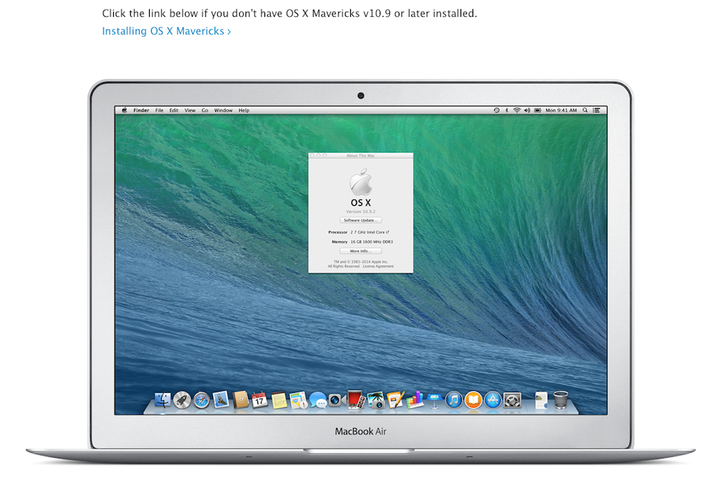
EDIT: Anyone also notice, this rather special MacBook Air?

EDIT 2: All installed now. Must say, UI is much more responsive, and surprisingly all of my add-on applications work fine. Only thing that doesn't work (as expected) is Server.app.
I'm guessing this is either the rMBA that everyone says is coming or they just put the wrong desktop on the desktop model for the image.
Soldato
- Joined
- 4 Oct 2008
- Posts
- 6,693
- Location
- London
I'm guessing this is either the rMBA that everyone says is coming or they just put the wrong desktop on the desktop model for the image.
Wrong screenshot, if they do ever do this mystical retina air, I think it would change the design at some point.
Soldato
- Joined
- 4 Oct 2008
- Posts
- 6,693
- Location
- London
Need faster interwebs.
Interwebs is fine. I'm getting about 600Kb/sec, not the usual 2Mb+.
Soldato
- Joined
- 4 Oct 2008
- Posts
- 6,693
- Location
- London
Interwebs is fine. I'm getting about 600Kb/sec, not the usual 2Mb+.
Guess the servers are getting pretty slammed.
Quick question, anyone have any experience with Virtual box/vagrant on Yosemite.
Soldato
- Joined
- 26 Aug 2012
- Posts
- 4,449
- Location
- North West
Guess the servers are getting pretty slammed.
Quick question, anyone have any experience with Virtual box/vagrant on Yosemite.
Not used Vagrant yet, but Virtual Box is being a little iffy.
Soldato
- Joined
- 4 Oct 2008
- Posts
- 6,693
- Location
- London
Not used Vagrant yet, but Virtual Box is being a little iffy.
Good thing I didn't update my main machine since I need it for work. Thanks for the feedback, going to test it quickly on my partition.
Well, installed the beta and its nice and all but 99% useless (as in, its no different to the previous OSX) to me because most the new features involve working with an IOS device in some manner which I can't do because I don't have access to IOS8!
Boo
Boo

Soldato
- Joined
- 26 Aug 2012
- Posts
- 4,449
- Location
- North West
is the black transparent theme in this beta?
Yes
Soldato
- Joined
- 15 Feb 2003
- Posts
- 10,142
- Location
- Europe
Glad to be rid of the brushed metal look but not liking Yosemite visually. It's almost cartoon like in the old days of Gnome/KDE on linux. Visually it doesn't feel polished.
It's fast and smooth though, and I've not encountered any issues so far, apart from Sophos occasionally using 120% cpu to scan/update.
It's fast and smooth though, and I've not encountered any issues so far, apart from Sophos occasionally using 120% cpu to scan/update.
Soldato
- Joined
- 4 Oct 2008
- Posts
- 6,693
- Location
- London
Woot.
Vagrant works,
Virtual box is fine,
Airmail is fine,
iTerm2 is working,
Spotify works,
Chrome works
Next to test is Photoshop and a few more apps for work, before I move over flow time on the weekend.
Chrome looks really out of place, I've tried moving to Safari but;
Inspector is better on chrome
Chrome sync's easier with my Nexus 5
I still have a lot of plugins for work that just arn't on Safari, from pixel perfect for UI tools, plugins to test Restful APIs, Google apps, and the chrome apps.
Safari does look much better, and is faster, Google really need to up their game or they will start to lose a lot of users.
Last edited:
Associate
- Joined
- 19 Dec 2010
- Posts
- 564
- Location
- The south
I'm trying to install the public beta but it seems to be hanging at the 4 minutes remaining mark ):


