

Hey,
I'm looking for some crit of my Concept design brochure.
It's for my Architectural Technology module, due tomorrow, but worth a massive grade.
I'd be ever so grateful if you could point out anything blatantly obvious that I've missed etc as to attain me a better grade!
This took me bloody ages so please don't be too degrading")

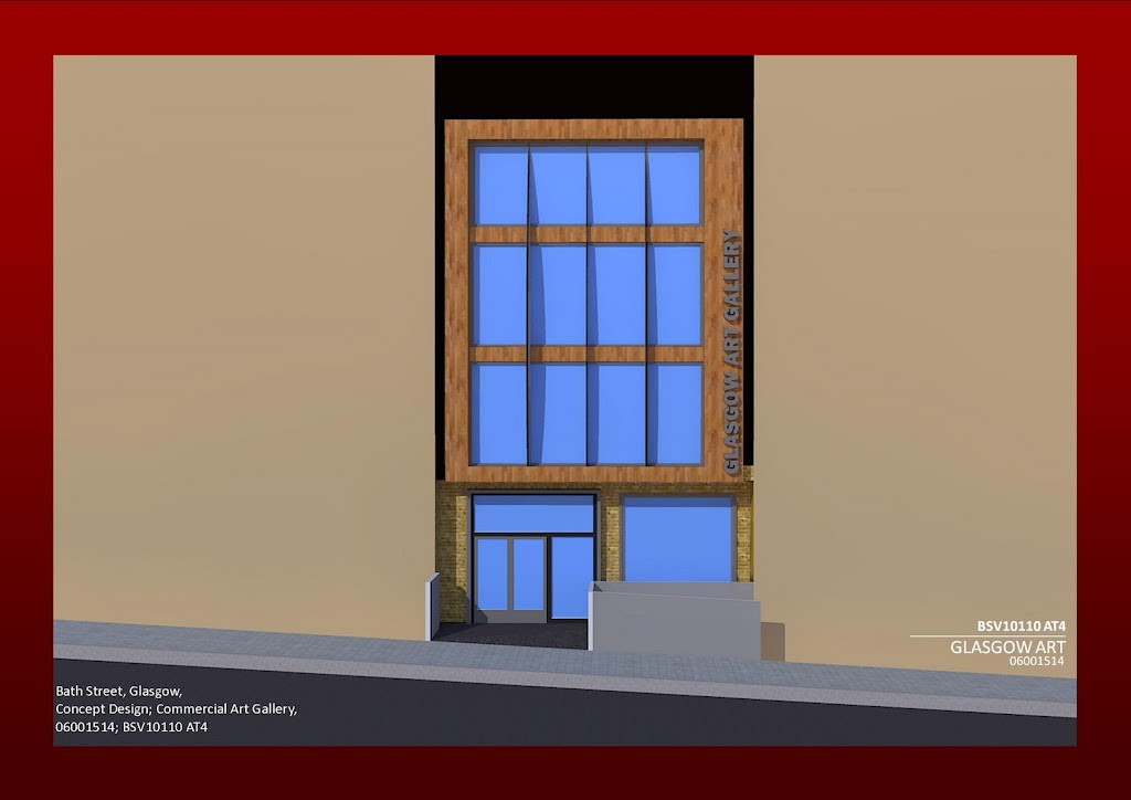
Before
After
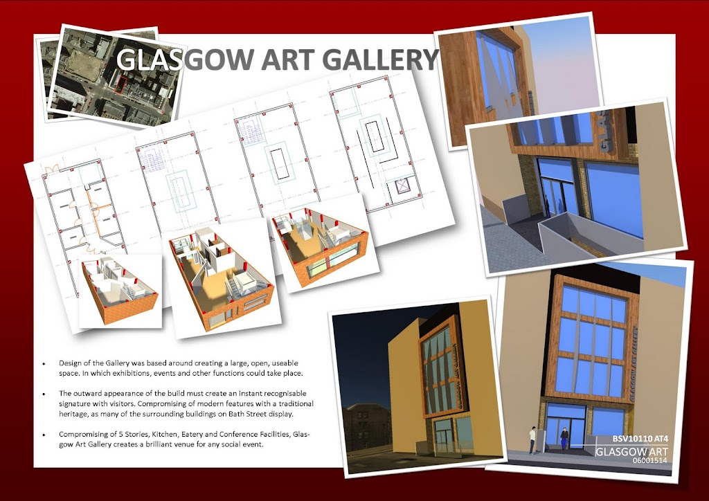
Before
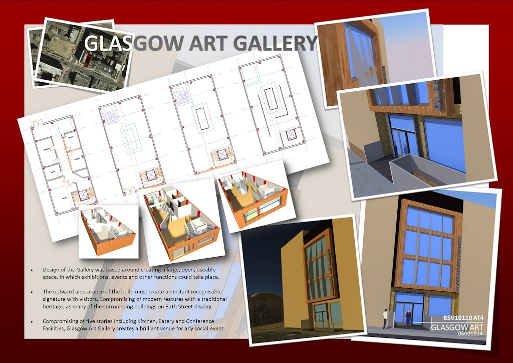
After
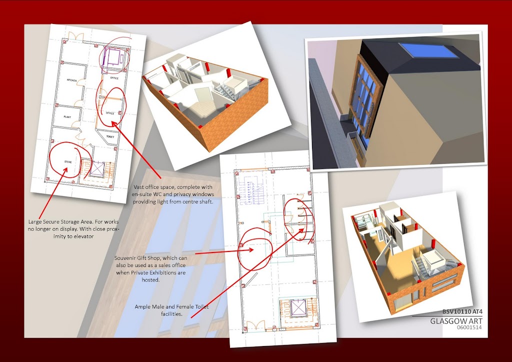
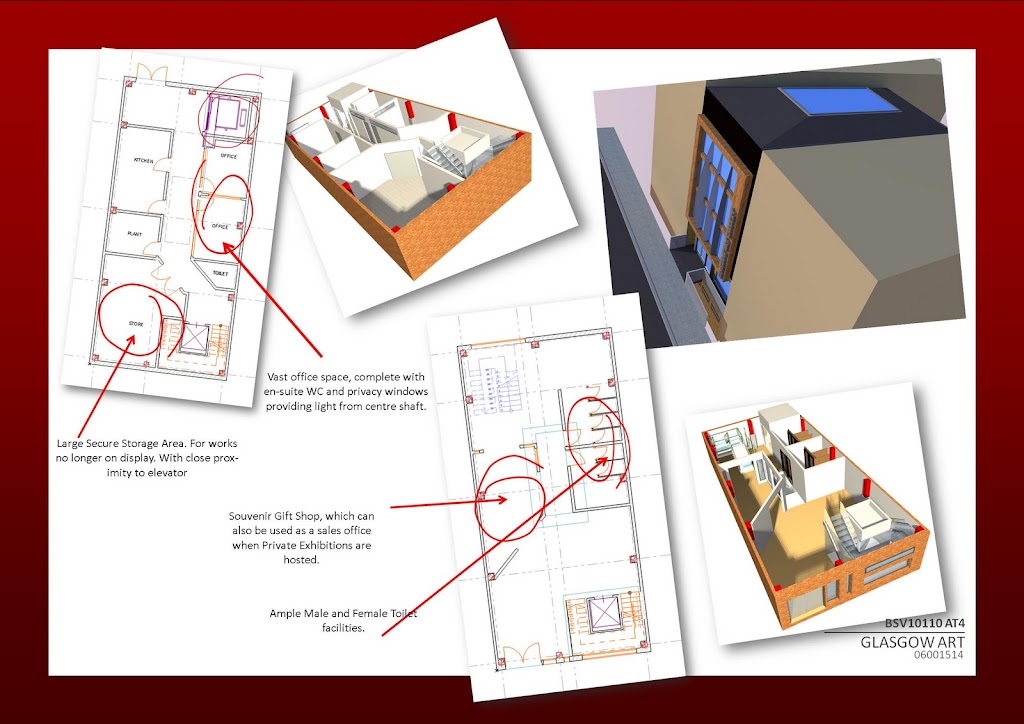
Before
After
Before

After
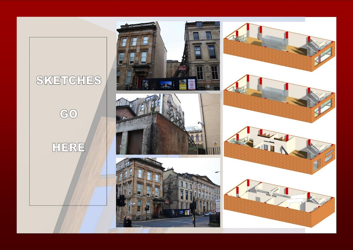
Another Page as requested;
Thanks guys
I'm looking for some crit of my Concept design brochure.
It's for my Architectural Technology module, due tomorrow, but worth a massive grade.
I'd be ever so grateful if you could point out anything blatantly obvious that I've missed etc as to attain me a better grade!
This took me bloody ages so please don't be too degrading
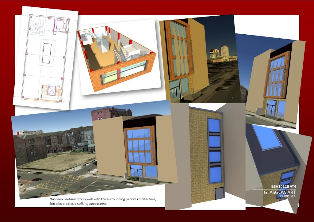
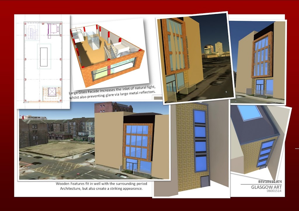
Before
After
Before
After
Before
After
Before
After
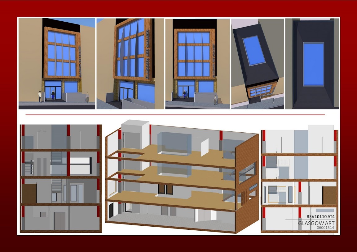
Another Page as requested;
Thanks guys
Last edited:
")
 Cheers though.
