Username placement changes

I was late to the party as the placement looks normal (above the avatar). What did I miss?
This:

0JMQgiQ.png
 
I thought it was just me too and recently posted in the forum update thread. :o

While the changed layout isn't too bad, it certainly looks awkward and out of place.
 
Abstract

The placement of usernames and avatars on forums is a topic of ongoing debate. Some people believe that usernames should be above avatars, while others believe that they should be below. This thesis will argue that usernames should be above avatars for a number of reasons.

First, placing usernames above avatars makes it easier to identify the poster. When usernames are below avatars, they can be obscured by the avatar, making it difficult to see who posted a message. This can be especially problematic in forums with large numbers of users, where it can be difficult to keep track of who is who.

Second, placing usernames above avatars makes it easier to scan forum threads. When usernames are below avatars, the eye has to travel from the top of the post to the bottom in order to see who posted it. This can be a bit jarring, and it can make it more difficult to quickly scan a forum thread for a specific user or topic.

Third, placing usernames above avatars makes it easier to distinguish between different users. When usernames are below avatars, the avatars can start to look similar, making it difficult to tell who is who. This can be especially problematic in forums with a lot of user avatars that are similar in style or design.

In conclusion, there are a number of reasons why usernames should be above avatars on forums. This makes it easier to identify the poster, scan forum threads, and distinguish between different users.
Ah, Mr. GPT, we meet again.
 
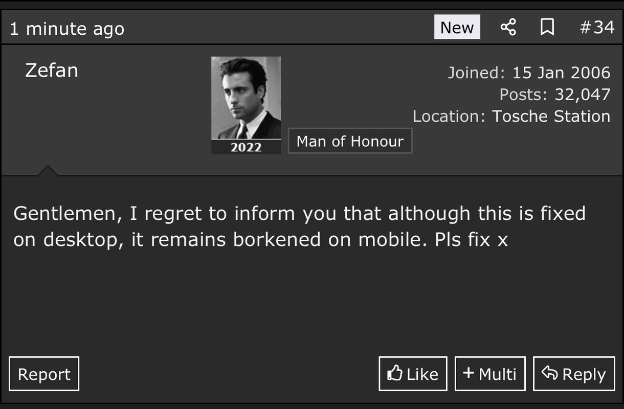
Gentlemen, I regret to inform you that although this is fixed on desktop, it remains borkened (actually no, just worse, names are now far left with a big scary gap between them and the avatar) on mobile. Pls fix x
 
Last edited:
For anyone who can’t see the mobile one:


Look at the state of that honking gap. Fixed now though thank heavens. I'm allowed to talk smack about it because I so know how these githubs work and stuff.

Now.. Is the current state this how it always was, with name just right of avatar on mobile? Someone please tell me, I don't know if I'll ever be sure if it's back to normal, don't make me resort to going looking for screenshots :o
 
Last edited:
Back
Top Bottom