Windows 7 Pro blurry text

AzZ

AzZ

Associate
Joined
27 Apr 2011
Posts
382
Location
Manchester
Hey everyone, I've finally upgraded to W7 and it's great except for the text! I've been messing about with it for a while now but I can't seem to get all the text looking as good as it did on XP.

The problem is with the 'ClearType' feature. When It's on the text in menu's look great and are nice and sharp, however text online looks like it's slightly bold and not crisp and sharp. When ClearType is off then text online looks like how it did on XP, nice and crisp and not bold (when I say bold I don't mean full on bold but slightly thicker than normal). However in menu's it's decent but not as sharp. I can't get a combination that works across everything.

Here are some screens to help explain:

6175006.png


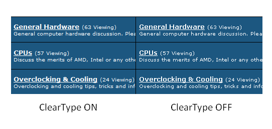
As you can see the text is more sharp when it's off and not blurry.


but now (when it's off) the text in the menu's etc is not 100%...

6175007.png


So basically:

ClearType on: Sharp text in menu's, blurry text on the web
ClearType off: Sharp text on the web, but not as crisp text in menu's.

This is really annoying me now as I've searched and played around with settings for ages today but not sure what else to try. Everything was crisp in XP which I have on my other PC.

As always I have the latest drivers installed and my monitor is running at it's native resolution.

Any ideas?
 
Yeah, monitor is running at the native res. and I have also been through that wizard but it's not made a difference.

As for browser I'm using Opera but I have the same issue in Chrome and IE as well. How does your text look guys?
 
Have you been though the 'wizard' when you turn on cleartype? It lets you select the best option

5c437960.png

+ 1 - Go to Control Panel - Colour Management - Advanced - Calibrate Screen & the Text Tuner happens after screen calibration, I would also recommend saving and installing best ICC profile for your monitor from HERE
 
Disable it, entirely, from the GUI and from the registry. ClearType NEVER, EVER, EVER looks decent on my LCDs. Never has done.

I wrote a regpatch for all my new builds to get rid of it. Merge to registry and reboot.

Code:
Windows Registry Editor Version 5.00

[HKEY_CURRENT_USER\Control Panel\Desktop]
"FontSmoothing"="1"
"FontSmoothingType"=dword:00000001
 
Last edited:
I've been through that wizard already but it didn't make a difference.

@sin Chase, With that reg. entry will everything just look how it does when I simply turn it off via the display settings or is there more too it?

Nice link with the ICC profiles Magus, that should be useful.
 
Assuming this is firefox related - I had this issue and after a bit of google searching came up with an about:config fix :)

In about:config search for gfx.direct2d.disabled and set it to true

I did not disable the hardware acceleration as mentioned above
 
To be perfectly honest you seem to have misunderstood the point of cleartype. From your screenshots it looks like it should do on both the webpage and menu shots. When cleartype is off on both the webpage and menu bar your shots show it as blocky and jagged, when it's on it shows as smooth and clearer on both. I've had this "issue" when using XP on other computers after being used to cleartype for several years, except the other way round...

Try cleartype on for a couple of days and see if you get used to it, it's just different to what you are used to which is why it looks wrong. After using it for a short time you will realise how nasty the text was in XP.:p
 
Assuming this is firefox related - I had this issue and after a bit of google searching came up with an about:config fix :)

In about:config search for gfx.direct2d.disabled and set it to true

I did not disable the hardware acceleration as mentioned above

They're exactly the same thing, unticking "Use hardware acceleration" in Options just changes that boolean about:config option.
 
Hmmm. I don't use Firefox so I'll check to see if my browser can turn it off.

@Amp34

I was also thinking it was just that I'm not used to it as I've been using XP for years. Although I agree it does make text look smoother, I can't help but notice there is a slight 'fuzz' around the text. I'll use it for a few days and I'm sure I'll get used to it. I'm still gonna have a fiddle about with some settings. Thanks for the replies everyone.
 
Yeah, looks just like mine. I think it's just that I'm not used to it tbh. I'm going to give it a try and I should get used to it within a few days.
 
Disable it, entirely, from the GUI and from the registry. ClearType NEVER, EVER, EVER looks decent on my LCDs. Never has done.

I wrote a regpatch for all my new builds to get rid of it. Merge to registry and reboot.

Code:
Windows Registry Editor Version 5.00

[HKEY_CURRENT_USER\Control Panel\Desktop]
"FontSmoothing"="1"
"FontSmoothingType"=dword:00000001

Can someone tell me the original values for these? I applied this and it looks awful now :/
 
Good thing I have a Dell then. I'm going to give it a try although I'm not sure if I'll notice a difference as I'm colour blind..lol
 
Back
Top Bottom