

You are using an out of date browser. It may not display this or other websites correctly.
You should upgrade or use an alternative browser.
You should upgrade or use an alternative browser.
[PIC_THREAD] Landscapes, Architecture, Seascapes
- Thread starter Rojin
- Start date
More options
Thread starter's posts


Soldato
DP, that shot of Montana looks remarkably like unigine valley demo. Certainly one heck of a vista.
Finally processed the first film from the 645 AFD. Fuji neopan 400 developed in undiluted D76. (7.5 mins @ 20 degrees)
Red filter with the 35mm f3.5. (21mm equiv) I left the data printed on the bottom in. The F number is missing as the older manual mamiya lenses are uncoupled. (says AV F--- 1/250, 0Ev compensation, S for spot meter and 639 is shot number)
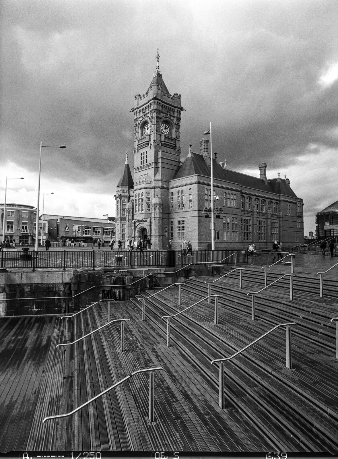 AFD3-Neopan400 by Kyle, on Flickr
Orange filter with the 80mm f1.9 (50mm equiv)
 AFD5-Neopan400 by Kyle, on Flickr
Finally processed the first film from the 645 AFD. Fuji neopan 400 developed in undiluted D76. (7.5 mins @ 20 degrees)
Red filter with the 35mm f3.5. (21mm equiv) I left the data printed on the bottom in. The F number is missing as the older manual mamiya lenses are uncoupled. (says AV F--- 1/250, 0Ev compensation, S for spot meter and 639 is shot number)
AFD3-Neopan400 by Kyle, on FlickrOrange filter with the 80mm f1.9 (50mm equiv)
AFD5-Neopan400 by Kyle, on FlickrLove this one!
Soldato
Finally processed the first film from the 645 AFD. Fuji neopan 400 developed in undiluted D76. (7.5 mins @ 20 degrees)
Red filter with the 35mm f3.5. (21mm equiv) I left the data printed on the bottom in. The F number is missing as the older manual mamiya lenses are uncoupled. (says AV F--- 1/250, 0Ev compensation, S for spot meter and 639 is shot number)
Orange filter with the 80mm f1.9 (50mm equiv)
, on Flickr
Liking the B&W...... your making me look again at ebay for a Contax645 and phase one P30's etc ....

How or what you using to scan the negs etc?
Associate
Not a picture, but still an awesome video of our landscapes.
Soldato
Originally wanted a contax, but decided since I already had an original mamiya 645 system the lens compatibility swayed me. I'm using an epson V750 pro with vuescan. It came with silverfast too, but I'm yet to try it.Liking the B&W...... your making me look again at ebay for a Contax645 and phase one P30's etc ....
How or what you using to scan the negs etc?
Llyn Idwal in Snowdonia:

Llyn Idwal by Iain, on Flickr
Catching some mini waves at Newborough, Anglesey:

Newborough Forest 03 by Iain, on Flickr
Llyn Idwal by Iain, on Flickr
Catching some mini waves at Newborough, Anglesey:
Newborough Forest 03 by Iain, on Flickr
Soldato

Soldato


Soldato
Some from a recent early morning bike ride
 Misty Morning by Jon Parry, on Flickr
 Sunny Ride by Jon Parry, on Flickr
Misty Morning by Jon Parry, on FlickrSunny Ride by Jon Parry, on FlickrSoldato
And a few more from recent bike rides with the LX100
 P1030174 by Jon Parry, on Flickr
 P1030172 by Jon Parry, on Flickr
 P1030159 by Jon Parry, on Flickr
 P1030140 by Jon Parry, on Flickr
 P1030128 by Jon Parry, on Flickr
 P1030104 by Jon Parry, on Flickr
 P1030088 by Jon Parry, on Flickr
 P1030076 by Jon Parry, on Flickr
 P1030059 by Jon Parry, on Flickr
 P1030049 by Jon Parry, on Flickr
P1030174 by Jon Parry, on FlickrP1030172 by Jon Parry, on FlickrP1030159 by Jon Parry, on FlickrP1030140 by Jon Parry, on FlickrP1030128 by Jon Parry, on FlickrP1030104 by Jon Parry, on FlickrP1030088 by Jon Parry, on FlickrP1030076 by Jon Parry, on FlickrP1030059 by Jon Parry, on FlickrP1030049 by Jon Parry, on FlickrSoldato

Soldato

I know you didn't ask for critique so feel free to ignore this post.
I like your last one (form kings Cross), much stronger composition than your other photos above and the processing is better as well IMO. For me personally, the other photos all have a flaw: horizon lines often in a unsatisfying place,either dead center or too high, leading lines and compositon guides end up poiting to no subject (e.g. the first bike photo has veyr strong guide lines lading otu to the edge of the photo where there is nothing, first spider web photo is extremely busy and hard to take in, etc.
Lots of potential though and some nice photos. Just my 2 pence.
Soldato
Thank you - feedback good or bad is always welcomed ")
The set with the bike in are literally grabbed snaps from recent bike rides when I have my camera in my rucksack, but still no excuse for the composition and I fully accept the PP on those may also be somewhat Marmite.
The Kings Cross roof was one I actually specifically went to take when on a recent trip to London and really need to make an effort to think and compose as a matter of course, which I dont at the moment
Thanks again D.P. much appreciated, cheers
Soldato
I appreciate these aren't as nice as most in here but they are my first attempt at reasonable shots.


Going back on Monday
Going back on Monday
Soldato
First ever visit to an abandoned location

Abandoned Church by Steve Rix, on Flickr

Untitled by Steve Rix, on Flickr
Abandoned Church by Steve Rix, on Flickr
Untitled by Steve Rix, on Flickr
Man of Honour


Associate
- Joined
- 27 Oct 2007
- Posts
- 608
A few from holiday in Portugal last week.
 Fishing on Mars 2 by Carl Jorgensen, on Flickr
 Fishing on Mars by Carl Jorgensen, on Flickr
 As far as the eye can see by Carl Jorgensen, on Flickr
Fishing on Mars 2 by Carl Jorgensen, on FlickrFishing on Mars by Carl Jorgensen, on FlickrAs far as the eye can see by Carl Jorgensen, on Flickr