photoshop mama's youtube tuts and my 'attempt' :p

:/

I get that result when I use Auto Levels and Auto Color in CS2.

You haven't gone natural, or 'corrected' the white balance at all, you've just buggered it in the opposite direction. She's almost gone green!

I know its pathetic to say i told you so, but thanks divine.
 
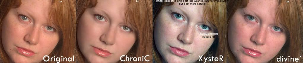
As fun as im finding this debate, please don't venture into the land of personal insults guys. I agree that the origional has a orange colour cast, and in teaboy5's example, this cast has been pushed way too far. But I still don't see this cast as being a problem or anything that needs correcting in any great amount. The colour corrected on in your example XysteR looks way to Cyan on this screen (admitadly a rubbish work one). The ginger of the hair has ended up with a grey/green tinge to it. Ive never been a fan of 'colour correcting' images to the 'correct' colour temperature, as I donb't see colour casts as a bad thing as long as they are deliberate and flattering to the image. Also if you watch photoshop mama's tutorials (well worth a watch if you haven't) she admits that she prefers a warmer skintone and as such deliberatly increases the colour temperature.

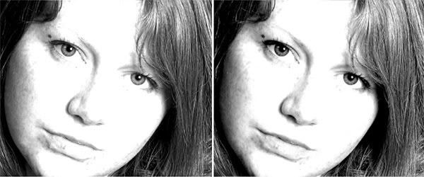
On a slightly different note, the image in the OP shows way to much softening. Even the hair has been softened which there is no need for. The trick is to soften the skin subtly, yet retain detail and sharpness in the eyes, nose, lips and hair.
:)

Very true, colour warmth and coldness play a part in images and its not a good idea to run 100% true black and true whites, even if my 'quick fix' is still way off its still closer to natural than the washed out cloudy orange casted image. So what i originally pointed out that it has an orange cast is correct and this is mainly due to the lighting it was shot under and the camera not setting things up correctly.

This is what my entire argument has been about, thanks for the confirmation.

Admittedly, today with natural light in the room i can see a very slight hint of cyan in my edit on both monitors, but it was by no means anywhere near a finished article, it only had hair, eyes and lips edits i.e sharpening etc. But to add to the mix the orange cast looks even worse today lol Last night i was sitting here in the light of a bedside lamp which didn't help and i normally avoid like the plague as i generally do my editing in daylight.
 
I know its pathetic to say i told you so, but thanks divine.

For what it's worth, virtually the entire IRC channel of Talk Photography also agreed with you :p

"he doesn't understand what he's doing" and "good god" being two notable comments related to XysteR's work :p
 
For what it's worth, virtually the entire IRC channel of Talk Photography also agreed with you :p

"he doesn't understand what he's doing" and "good god" being two notable comments related to XysteR's work :p

My work? lol it was a 5 min edit, if that? and 5 mins for an ultra contrasted b&w jobbie. How can you pull my work down if you've not even seen any of it?

Did the entire IRC channel agree that the shot has a heavy orange cast which is what my entire argument was about? At least i've admitted this am that i can see a slighness of cyan on my 2 monitors.


Edit: I've had a few people at my old workplace look through all these images on a whole range of different monitors which run varied from CRT's through LCD's. They all commented things like 'tango bird' etc. Another friend of mine said "Why bother? you were 'polishing a turd' in the first place, they just failed to see that the image is obviously way too orange and edited it 'willy-nilly'. ChroniC's 'scarebrushed' (oh how i chuckled at scarebrushed) edit, looks to be inline with image editing we used to see on the yester-year porn sites". To say i nearly wee'd myself at this comment is an understatment!
 
Last edited:
'Your work' was quite obviously referring to the pictures you posted in here.

To be honest, it doesn't read like all you were arguing was that there was an orange cast. I think everyone here agreed there was a cast to it. Your arguments seemed to go a bit further than that.

I don't even know what you were on about with your paint references as the colour spectrums for both are different and mix/work differently anyway, you can't compare them.

Your black and white picture was completely pointless too, imo, as you've just hit desat and then +** contrast or something, which is not really how or why the sort of black and white image you appeared to be trying to achieve is made. You've just blown half the right hand side of the histogram into white.

All i said was. It needed the nasty cast sorting. Chronic said "i can't see why" so i said ok gimme 5 mins, 5 mins later i threw up something that was far closer to the truth, even is if was a tiny bit on the cyan, it was still miles better. Then it went on with me trying to explain that skin has tones of greens, blues, purples, and even yellows and browns that he simply would not believe! Thats all.

My 5 min B&W edit? Your so far wrong dude, it was an edit made in the channel mixer with levels and curves adjustments to feathered selections in hair, eyes, lips along with sharpening to certain areas and one heal of the spot to the left of her lips.

It seems to me that everyone naturally thinks.. urgh, freckles, ulgy! lets poorly brush them out to make the image look too soft and as my mate said 'Scarebrushed' lol
 
In my opinion the original picture only needed a small adjustment, you've taken it way too far and seem far too hung up on your 'exact blacks and whites' etc. Photography (or any kind of visual art) is not something that can be done by numbers or rules.

Well, you wasted your time in the channel mixer and feathering stuff as it looks 95% identical to desaturating and increasing the contrast and brightness :p

I couldn't care less whether the photo needs airbrushing or not. The OP was following a tutorial on airbrushing and this was the image used in it.
 
Because i'm bored:
gingercomparison.jpg


I know which order I would put them in as to which looks 'correct'
 
In my opinion the original picture only needed a small adjustment, you've taken it way too far and seem far too hung up on your 'exact blacks and whites' etc. Photography (or any kind of visual art) is not something that can be done by numbers or rules.

Well, you wasted your time in the channel mixer and feathering stuff as it looks 95% identical to desaturating and increasing the contrast and brightness :p

I couldn't care less whether the photo needs airbrushing or not. The OP was following a tutorial on airbrushing and this was the image used in it.

Nope i fully understand warm and cold colours and why they work in images. That quicky i done was to pull the shot to near normal light just to show how stupidly orange the shot they all used was and didn't do anything about.

I wasted my time in the channel mixer? don't talk poo it works nothing like desaturation and contrast/brightness? The channel mixer works on a valued percentage basis in seperate RGB channels and brightness/contrast is just a non informative value of + or - greyscale.

Honestly now i know how little your knowledge is i'm giving up lol
 
I know how the channel mixer works, thanks very much. What I mean by wasting your time is that what you've achieved with it, was so **** poor that you may as well have just used desat and bright/contrast because it looks almost the same.

If you actually had any ability to use it properly, then yes, it's a much better way of converting to black and white. One which I have quite vocally advocated in the past here.

If you knew how it works you wouldn't have made such a stupidly mindless comment :rolleyes:

Poor edit? yup admittedly a 5 min jobbie. looks nothing like a desat, contrast/brightness edit as that would do it uniformly over the entire image? You obviously aint got a clue what your arguing.

Chap from IRC. Not a word of orange cast?
 
Ah but you see, when you actually compare what you get when you simply do desat and contrast/brightness then you might see my point...

bwcomparison2.jpg


One is your edit, one is me doing it with desat and brightness/contrast. If the difference is so obvious for my comments to be 'stupidly mindless', you tell me which is which :)

Besides, my comment is entirely unrelated to how the channel mixer works, it's nuances, or anything like that. It was purely saying that you may as well have not bothered, as what you have achieved looks 95% the same.
 
Last edited:
If you knew how it works you wouldn't have made such a stupidly mindless comment :rolleyes:

Poor edit? yup admittedly a 5 min jobbie. looks nothing like a desat, contrast/brightness edit as that would do it uniformly over the entire image? You obviously aint got a clue what your arguing.

Chap from IRC. Not a word of orange cast?

As divine pointed out, it does look just like a increased contrast. The highlights are terribly blown out which isn't right. The effect you're after isn't blown highlights, its high key or correct use of certain channels in B&W. As for the orange cast, theres one there. Your edit was basically auto levels which has left it a tiny bit green.

woo1-20071016-195136.jpg


woo2-20071016-200407.jpg


Probably not the best idea throwing your weight around and insulting people when you're posting images like that. Especially not now that I can post again :D
 
Because i'm bored:
gingercomparison.jpg


I know which order I would put them in as to which looks 'correct'

I'd like to see a "correct" shot to compare it with. Without knowing what the model actually looks like, you could all be arguing until the cows come home.

When those shots are side by side and at that size, I'd say the third one along looks like the level of light you get through a window on a cold winters day (at least around here anyway), but it also looks slightly washed out.
 
Back
Top Bottom