

You are using an out of date browser. It may not display this or other websites correctly.
You should upgrade or use an alternative browser.
You should upgrade or use an alternative browser.
Design/Logo Help Please!
- Thread starter Nix
- Start date
More options
Thread starter's postsNothing it realistically going to be ordered for another week yet (minimum) anyway.
Any input is appreciated. Still a little stunned the thread's taken off the way it has!
stuff the other work im having a go at this now
")
post some stuff soon

OcUK in "genuinely helpful Photoshop" thread shocker??
I know!


Neoni, that's bloody excellent.
The game has been upped people!


Neoni that's some great work there!
Cheers guys, only quick ideas, gonna have a bit more of a play when i get time
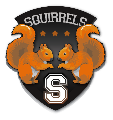
I was informed today that the actual name is "The Headless Squirrels" as opposed to just "The Squirrels".
Dunno if that gives anyone anything to play with!
Now that, will be pretty hard to make (logo)
Why would anyone want to have a headless animal as their logo anyway ?!!?
Neoni, Crofty: Awesome job guys. Real nice.
Now that, will be pretty hard to make (logo)
Why would anyone want to have a headless animal as their logo anyway ?!!?
Neoni, Crofty: Awesome job guys. Real nice.
A squirrel with its head attached is still preferred. The name is more for pedantry.
I imagine it wouldn't be too taxing for Neoni et al. to alter their current works to reflect the name change as opposed to decapitating small virtual mammals.
Personally, I imagine with Neoni's example: 'The Headless' could be easily encorporated above 'Squirrels' but smaller and perhaps in a different fontface/type, etc.
ill have a go for you now fella just got home from the ladys so not seen this

Cheers Neoni. Hate to be a pain, but is it possible the lose that 'h' or play around with it somehow? It just looks a little out of place if I'm honest!
If it's easier, you could use the earlier non-headless logo and put 'The Headless' in a thin band above the badge akin to how England do theirs with the three-lions and 'England' above it, it that makes sense.
Thanks again everyone!
If it's easier, you could use the earlier non-headless logo and put 'The Headless' in a thin band above the badge akin to how England do theirs with the three-lions and 'England' above it, it that makes sense.
Thanks again everyone!