I think you should have painted the entire room the same colour not the 2 different shades, as to my eyes they don't complement each other that well.
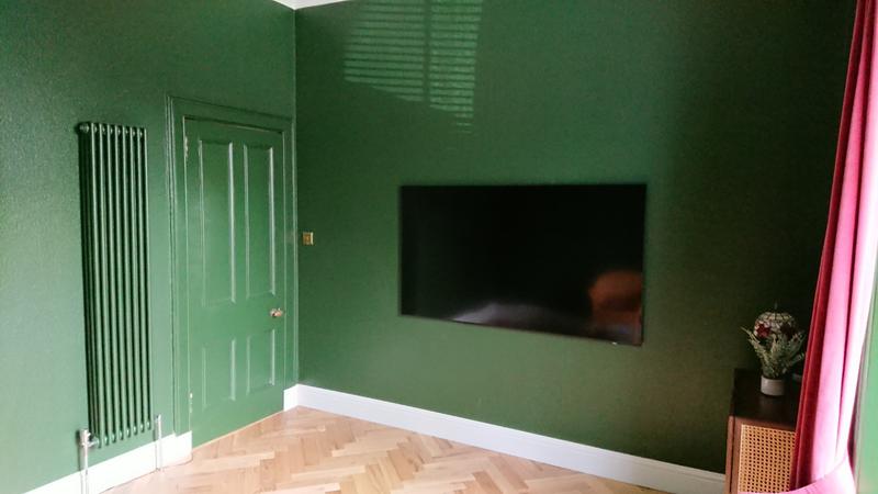
I think out of the pair of them the green which is on the window wall would be what I see as being more elegant, but its to each their own with this kind of thing isn't it!?
I think out of the pair of them the green which is on the window wall would be what I see as being more elegant, but its to each their own with this kind of thing isn't it!?
Last edited:
")