Thanks for the comments guys, tagline dispensed and shoved in the one off the main shop page.

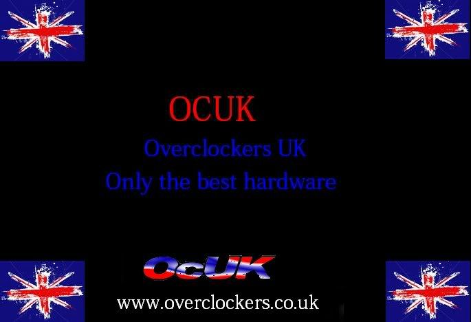
I wasn't happy with the arrowy bit [corner of the GB flag] from before and I notice some of you picked up on that. I realised it was loosing the 'O' shape a bit so this is a revision reflecting that.
My one suggestion for your kinda-retro idea (liking it), is to tighten the line where it is coloured... It might be hard to explain - imagine if you took the 'O', and then only using the curve of the O, did the same effect you have now. At the moment, it seems a little disconnected from the design in my point of view. Sort of like the colour bands have been physically wrapped around the 'O' - unless that's what you aimed for, and it proves to be popular!
I have been known to be wrong

John
-edit - I think you've kinda done it now...


")