Associate
- Joined
- 8 Feb 2008
- Posts
- 801
- Location
- UK
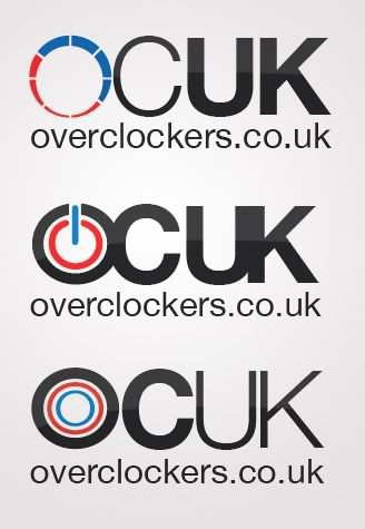
they look ok but a high quality jpeg would be a better bet


Have too agree.. I think a good logo should work in a few flat colors with no gradients or fiddly-detail.So many of these entries just aren't logos.

Surely a big company like ocuk needs a striking professional logo made by professional designers, instead of one made by some random board member
Yep thats what I was going for. I was thinking of the practical side of things, like whether it will look suitable on a t-shirt yet still looking clean...Simple and effective.

Surely a big company like ocuk needs a striking professional logo made by professional designers, instead of one made by some random board member


If you paid someone to design your logo and they gave you this:

I think you would ask your customers to design you one next time too
Professionals can make an equally bad hash of things (and charge you £20,000+ for the 'privilege'). This seems like as good an idea as any to me (it can always be 'refined' professionally later - that's another benefit of having the original vector files).Surely a big company like ocuk needs a striking professional logo made by professional designers, instead of one made by some random board member

Try and simplify a bit maybe?


