Soldato
- Joined
- 8 Feb 2009
- Posts
- 3,462
- Location
- Sheffield

My favourites so far (although I haven't read the whole thread)
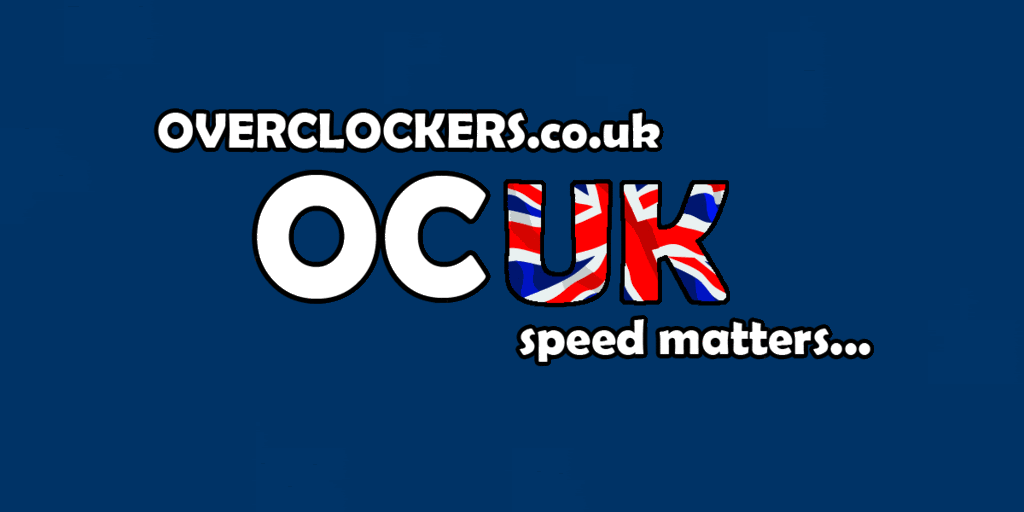
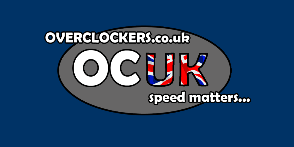
Here's my version

I tried to keep it clean and simple but also in keeping with the current logo style. What you think?

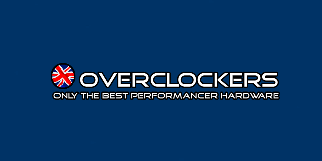
lol sorry but that logo says nothing to anyone, a generic font with blocks of random colours .. bit weird
For all i know overclockers is a company that makes clocks
^Motto taken from PistonHeads?

On a related note, I was happy when I finally found out the term for the following concept http://en.wikipedia.org/wiki/CryptomnesiaI was curious at to where id gotten it from...
")
My favourites so far (although I haven't read the whole thread)
Brilliant.
To be honest im surprised no-one, not even myself came up with that idea before !
Hey all..was trying to post this yesterday but it took all day for my account to be activated. Never been on forums before but have used OcUK for a long time now so thought id give it a go
lol typo on 'would'..and its also transparent but the jpeg format made it go white :S

I came up with it 10 pages ago
4 - By submitting a logo to us the competition participant hereby assigns any and all trade marks, service marks, registered designs, copyrights, design rights and any other intellectual property contained within the submitted logo to Overclockers UK (Esnet Ltd). The entrant hereby warrants that any submitted logo is free of any license to third parties and does not infringe third party intellectual property rights.
i dont rly want to enter the competition... just because of all the copyrights etc etc.. i know that i done them my self but im not 100% sure if the fonts used are legal to use for comercial use... it said in the licenze free...