

You are using an out of date browser. It may not display this or other websites correctly.
You should upgrade or use an alternative browser.
You should upgrade or use an alternative browser.
-= Design Our New Logo & Win a XFX GeForce GTX 285 Black Edition Graphics Card =-
- Thread starter Spie
- Start date
- Status
- Not open for further replies.
More options
Thread starter's posts I still prefer your original design (3rd down in 1st pic)
Sort out your kerning on the middle entry and you might be on to something. Classy sans-serif, pretty non-descript, trustworthy, not tacky. You could take it into illustrator, give it a bit of custom type treatment if you feel inspired enough.
Any better?

This'll pretty much be my last entry haha.

Associate
- Joined
- 20 Jul 2007
- Posts
- 2,135
- Location
- A sunnier or damper area than Ron-ski....
Good luck everyone - would love to see the full list of images from this thread on a page/gallery or something, there's been some brilliant entries! Nimz & Skippi's stood out for me!
Am heading down south till Wednesday, so I'll probably only find out who's won it then! (grr - will need to find a webcafe!)
Am heading down south till Wednesday, so I'll probably only find out who's won it then! (grr - will need to find a webcafe!)

Caporegime
- Joined
- 1 Mar 2008
- Posts
- 26,303
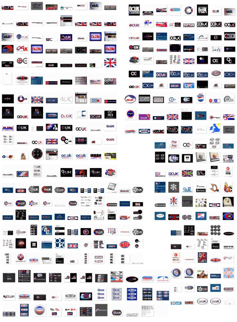
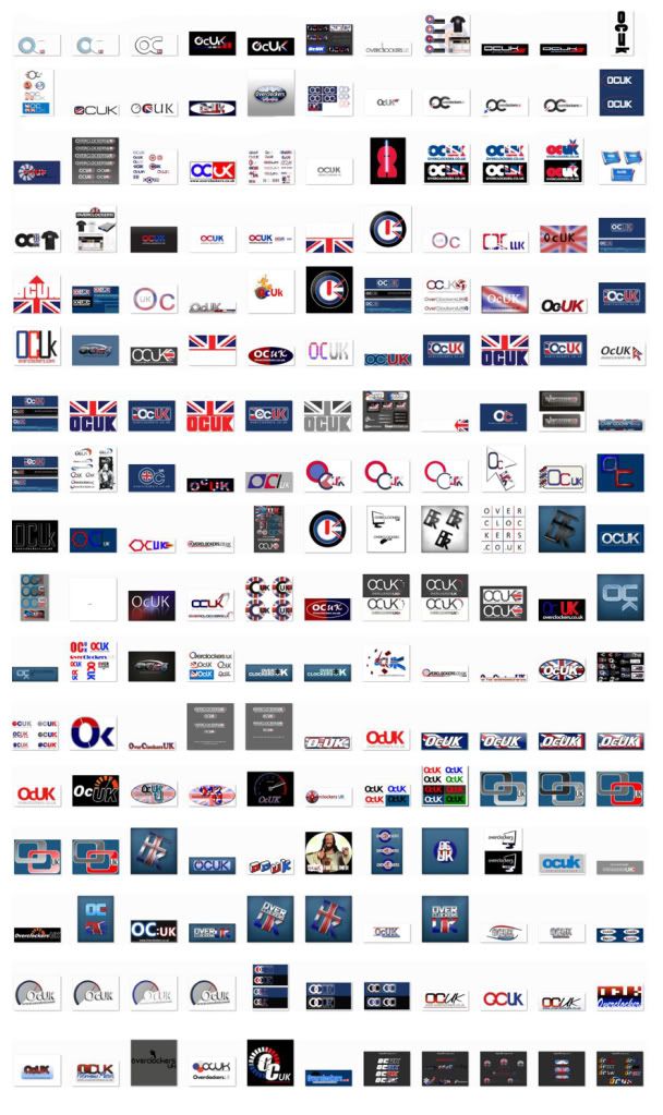
If I'm bored tomorrow, I'll sort out a gallery, or a huge image with all the logos from here on it.
I have not check this thread for a while but the standard has certainly gone up a couple of notches. Really nice work from some people, wish I would have had the time to contribute more myself but uni final yr project and what not has got all of my time at the moment.
Good luck everyone")
Good luck everyone
Soldato
- Joined
- 20 Jan 2004
- Posts
- 4,128
- Location
- Fife
We forgot to do the pud! 
Soldato
- Joined
- 19 Dec 2006
- Posts
- 9,262
- Location
- Saudi Arabia né Donegal
Shush! Don't remind them. Perhaps we can have a similar competition near christmas...
Soldato
- Joined
- 10 Apr 2006
- Posts
- 7,853
- Location
- North West
Good luck to all the entrants! Wish I had the time to enter this week!
Some good entries in here so should be a difficult decision!
Some good entries in here so should be a difficult decision!
well done all those who entered, some seriously tasty logos by some photoshop pro's in the past 3-4days, there's about 6 logos atleast that would be perfect for ocuk, think they'll struggle choosing a single winner!
wonder what spie will do, maybe post his favourite 10 and get us to vote which of those we like the best. he should really choose the 1 we like the best as the logo is aimed at attracting us. my opinnion atleast.
wonder what spie will do, maybe post his favourite 10 and get us to vote which of those we like the best. he should really choose the 1 we like the best as the logo is aimed at attracting us. my opinnion atleast.
Last edited:
Associate
- Joined
- 24 Apr 2009
- Posts
- 5
- Location
- Belfast
CONGRATS
Congrats, well done and all the best to everyone that entered. With over 500 submitted designs, im sure that this competition can be seen as an outstanding success.
I for one have enjoyed looking through all the designs and once again, well done and best of luck to everyone.
Congrats, well done and all the best to everyone that entered. With over 500 submitted designs, im sure that this competition can be seen as an outstanding success.
I for one have enjoyed looking through all the designs and once again, well done and best of luck to everyone.
Caporegime
- Joined
- 1 Mar 2008
- Posts
- 26,303
Ledge.
I posted my entry in the competition thread (http://forums.overclockers.co.uk/showpost.php?p=13956662&postcount=43) but noticed it's not in your collage... does this mean it wont be considered?

Last edited:
Soldato
- Joined
- 17 Oct 2002
- Posts
- 10,317
- Location
- Stoke
Everything will be considered.
Thank you for your entries. Looks like we're going to be busy over the next day or so
Thank you for your entries. Looks like we're going to be busy over the next day or so
- Status
- Not open for further replies.