

You are using an out of date browser. It may not display this or other websites correctly.
You should upgrade or use an alternative browser.
You should upgrade or use an alternative browser.
My ICT A-Level website
- Thread starter leew123
- Start date
More options
Thread starter's postsAssociate
- Joined
- 11 Jan 2012
- Posts
- 1,466
- Location
- Bedfordshire
A-Levels, They accept this as work now?
Yup. I'll show you a screenshot of what I submitted at a-level. Hang on.
Associate
- Joined
- 11 Jan 2012
- Posts
- 1,466
- Location
- Bedfordshire
Here we are. This was submitted as the template (Obvious improved upon [greatly{hey I'm using the "bracketing system"<invented by Angus>}]).
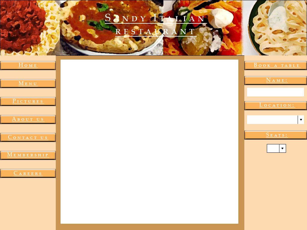
Looking back on this now is embarrassing! Haha. Can't even read the title well.
Looking back on this now is embarrassing! Haha. Can't even read the title well.
Associate
- Joined
- 11 Jan 2012
- Posts
- 1,466
- Location
- Bedfordshire
Haha. Wow. I'm guessing they mainly grade you on the theory... I hope
Yup. As long as it's a working website they don't really give a damn about the design!
We also have to make the site with dreamweaver, so we have to use a lot of tables..
Dreamweaver doesn't force tables...
we don't learn coding at A-Level...
HTML isn't really coding, but that said, this is what is wrong with ICT teaching at the moment. No coding.
There are a few accessibility issues with the website, no screen readable navigation menu, the grey on black text is possibly not contrasting enough, the blue on black for hyperlinks is also an issue.
Thanks for all the feedback, to everyone who mentioned the hit counter; we have to have one. We also have to make the site with dreamweaver, so we have to use a lot of tables.. we don't learn coding at A-Level...
But I'll try to use the rest of your advice, thanks guys")
Were you given a reason as to why you need the counter?
Soldato
- Joined
- 3 Oct 2009
- Posts
- 19,893
- Location
- Wales
Hit counters are awesome. I remember the red flaming text mine had for my school website.
Im my Biology degree we had to make a website for our second years final term research project. We had just 1 lecture and a handout on how to do that and it was easy peasy for everyone. It was also automatically assumed that we were already profficient with word / PowerPoint / excell, the only thing we were told was not to use stupid sounds and fades in our presentations.
ICT = a complete waste of a subject. Its really just the bare basics of how to use a PC for absolute nubcakes.
Regarding programming, I had to do that in AS level computing to make a simple text based football game. Computing is what you should choose if wanting to go into this field, never ICT.
ICT = a complete waste of a subject. Its really just the bare basics of how to use a PC for absolute nubcakes.
Regarding programming, I had to do that in AS level computing to make a simple text based football game. Computing is what you should choose if wanting to go into this field, never ICT.
Last edited:
Soldato
- Joined
- 13 Aug 2004
- Posts
- 8,419
- Location
- England
The links at the top take up a lot of the page that could be used by the 'news' and 'top selling artists', those two sections could also use a change of colour tone to make them more visually separated.
Associate
- Joined
- 5 Jun 2004
- Posts
- 1,341
- Location
- Hythe, Hants
Image maps, really! been a while since I've seen one of those used ")
I remember when we did this. Our IT teacher came storming into the room one day telling us with amazement that we were all going to make website, he then told us all we had to do was create a word document, but select save as html file, and then it would open in IE. He was amazed rubbing one out in the corner over word html files while we all made terrible websites and got A grades lol. This was in 1999 though to be fair and it was primary school 
TBH Its more like kindegarten level of work. There should be a new A level and degree for Gaming, where you play games, write reviews, make YouTube lets play videos, make a gaming blog, and get field trips to all the major gaming events and stuff.
I don't see why not, people can make loads of money nowadays by simply doing that.
I don't see why not, people can make loads of money nowadays by simply doing that.
Permabanned
- Joined
- 9 Aug 2009
- Posts
- 12,234
- Location
- UK
You have made a website that is live on the internet... so how does one get extra marks?